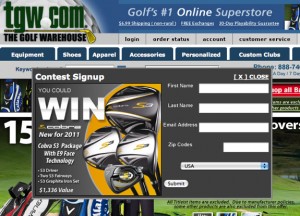
 Tim writes “I attended your lunch thing at NEMOA and I was very interested in what the guy from The Golf Warehouse said about pop-ups. I hate those {redacted} but when I heard what you two said about them, especially what the golf guy said about them, I figured I should test them on our site. What can you tell me about them?”
Hi Tim:
Yes, Brad (the golf guy) was fantastic. He used to work at Orvis (they’d rather rather go out of business than “sell” someone) so I think www.tgw.com was probably quite the culture shock for him. (The Golf Warehouse is VERY aggressive, which I LOVE.)
They do a sweepstakes pop-up.
Sweepstakes pop-ups work well because of the offer (obviously) but also because you can do them over and over. Some folks will come back every month to sign-up again – it’s sort of like FREE ECOA (email change of address!)
Not everyone can do a sweepstakes though so if you can’t, you can offer a free info download (for example, 23 FREE tips for improving your garden!)
If you don’t want to do anything, that can work too depending on your creative.
The thing about email pop-ups (or any kind of banner for that matter) is that they’re highly dependent on creative. So if your pop-up doesn’t work it’s most likely because your creative SUCKS. (Good creative on pop-ups is dependent on the copy and art AND most important, the action directives.)
What else should you know about pop-ups?
Once the user has closed them, keep them closed. Don’t open the pops over and over on every page, till you’ve tested it.
Test different sizes and shapes. You never know what will work best for you till you test it.
 You should also test the location. Sometimes pops work in the upper left. Others they work in the middle or lower right. Once you’ve gotten really comfortable with your creative, test the place you put it.
Always make sure the way to close the box is clear. Some “experts” tell you to bury the close but it’s not the best strategy. It may work overall – in terms of better sign-ups, but it often impacts your other steps of the sale.
ALWAYS keep a sample of people who don’t get the pop-ups. It doesn’t need to be a big sample, but you should have one. Why? Surprisingly it’s the best indicator when things go wrong with your pop-ups.
Develop 2-3 different pop-ups. One of the things that folks don’t typically do is deal well with the repeat visitors. If someone comes to your site and gets one pop-up, the next time they visit you can show them a completely different pop-up to see if they respond to that. You should also test ONLY showing one pop-up per series of visits. A series generally lasts 21 or so days.
Work the capture box. Many email capture pop-ups fail at first because people make the capture box (where you put your address in) too small. I know that capture boxes aren’t pretty but it’s important that they are big and easy to use. Don’t forget an action button.
Work your landing pages. Once someone has given you their email address, make sure to thank them and then tell them what to do next. The confirmation pages are often as important, if not more important, than the capturing itself.
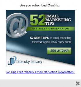
 It’s important to note that email pop-ups work for all sorts of sites – not just ecommerce sites. They’re good for service sites and blogs alike. Christoper Penn (aka @cspenn) writes about his personal blog pop-up experiences here.) To the left, you’ll see the pop-up they use on Blue Sky Factory where Chris is a VP. This is a VERY solid pop-up, especially the SIGN UP TODAY button.
Have more questions about email capture pops? Jot them in the comments below or send me an email at info@amyafrica.com.
Amy,
Another great article. Do you know of any services/sites that can help to easily build a pop-up for email collection? We use ExactTarget for our ESP.
Adam
Thanks Adam!
If you have a team of designers in-house, they can probably do it and then just feed ET a list on a daily/weekly basis.
If you don’t, send me an e-mail and I will give you some names: info@amyafrica.com.
Thanks again for writing!
Adam: The one that we use at Blue Sky Factory (mentioned in Amy’s post) is a WordPress plugin. Yes – both our blog and main site are run on WordPress! The plugin is called “WP Super Popup 0.9.4”
Hope it works as well for you as it does for us!
dj
Dude!
Thanks so much for the BSF love. I have to say, I am so so SO anti-popups. It kills me that Penn has one on his personal blog and that he put one on the Blue Sky Factory blog (and main site) … BUT … they work. At least, they work for us. However, what we don’t really know is how many folks come to our site or blog, see the pop-up, get annoyed (curse silently or aloud), then never come back. Know what I mean?
DOAD
DJ Waldow
Director of Community, Blue Sky Factory
http://www.blueskyfactory.com
@djwaldow
As I always like to say: test and find out what happens. I am thinking we are going to run a test and see what happens.
Dude of all Dudes (aka DOAD):
Thanks for writing!
True confessions: I hate them too. The thing is that if you have good creative and/or a stellar offer (like your FREE tips), they’ll work. In fact, I’ve never seen them not work and I’ve tried them on hundreds (thousands?) over the past 15 years.
Just so you know, I’ve done a lot of testing on how it impacts bounce rate and even in the worst case scenarios, it hasn’t been worth pulling the pop-ups. With that said, I do recommend to folks that if someone comes and then leaves immediately that you don’t offer the pop-up the first time they come back. You can change this when you know you’ve got your system mastered but at the beginning it can be helpful.
Thanks again for writing DJ.
P.S. I love me some @cspenn. That guy is a little Einstein.