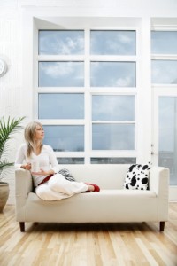
 How many windows are in your house?
I’ll wait while you figure it out.
You’re back?
Ok.
So, how did you count?
Did you go through room by room and count the windows?
You did, right?
That’s because the old brain (aka the brain that buys) is most comfortable when it’s in the visual mode. It’s happiest – and most successful – there.
We SEO our sites till the cows come home so that we can be ranked #1 in Google. We forget that the user who is coming from Google doesn’t see words, it only see pictures.
That’s an issue.
Every page on your website that doesn’t have pictures/graphics/visuals is a dead-end, meaning that the user is NINE TIMES more likely to leave on that page or immediately on one of the two subsequent pages.
This is applicable for every website – whether it’s a blog or a powerhouse ecommerce site.
That means this message is for you.
I can so totally agree with this one.
As part of the upgraded website design for my new company, we went as far as changing the graphic in the header of each page, yet keeping a consistency of message / image. Every window a different view! So far we have received great feedback and found more pages viewed ~ even though we did not direct people to more pages. This is still a website in creation/flux as we listen to and understand our potential partners. BTW in case you are interested http://www.emidaASIA.com (but not ready for your candid goOVER yet @CASUDI
You always have something new going on Caroline, it’s impressive! By the way, I like the direction the new site is headed in. Please keep me posted!