This is part 3 of a 5-part series. Part 1 can be found here. Part 2 can be found here. Part 4 can be found here. Part 5 can be found here.
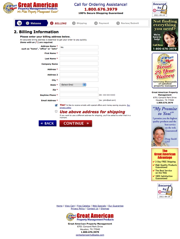
11. Use a temperature bar. Yes, they’re ugly. Deal with it. Users like temperature bars because they set expectations. Some checkouts are 11 steps and others are 1 so folks aren’t really sure what they’re getting into – temperature bars show them how many steps there are so they know how much longer they have left.
Don’t want a temperature bar because it’s not aesthetically-pleasing? Research has repeatedly proven that users who know where they are in the process have a better chance of converting. Not only that but the further they get into the process (read: the more the temperature bar lights up), the higher their propensity is to finish the process. In other words, the closer they are to a known completion, the less chance they have of abandoning.
12. Format your fields vertically. City,state, zip should be on three lines, not one. Why? A couple reasons. First, vertical aligned fields produce fewer errors. Second, users often think that they’re “moving faster” when the fields are vertical. This is important because speed and and security both factor prominently into your users checkout experiences.
13. If there’s only one choice, don’t use a dropdown. This is one of those little things that everyone thinks is innocuous that’s not. In a typical user’s mind, one choice in a dropdown equates to something “broken.” Anytime something’s “broken” on your site, users leave. En. Masse.
14. Review your error handling. On average, we lose about 13% of people from checkout due to poor error handling. About a third of the time this happens because users don’t can’t figure out where they screwed up. About 20% of the time, it’s because our messages are “rude.” Remember, if/when anything bad/wrong happens in your checkout it’s YOUR fault – whether or not your user is a complete idiot. (Rule of thumb, tell the users their mistakes all at once and clearly delineate the field(s) they need to fix as well as how they need to fix them. This is especially applicable if you have mobile traffic.)
15. Address privacy and security. This doesn’t mean that you should make your site look like a Girl Scout’s sash with a bazillion and one badges all over the place. (That technique usually hurts WAY MORE than it helps.) However, you should promote your security (i.e., 100% secure shopping guaranteed or whatever it is that you offer) in the righthand column and at the bottom.
16. Include your full contact information. Make sure your phone number is seen in at least three areas (top, right and bottom) and be sure to showcase your complete contact information at the bottom. You don’t need to make a big deal of it but it should be there. Include your address, fax number, email address and phone numbers. If you get a lot of international orders, you should also consider offering a number that’s NOT toll-free.
17. Use a picture of a person in the righthand column that you’d give your money to. Let me clarify that, someone who looks trustworthy (think Santa Claus or Wilford Brimley), not a hooker or a bailbondsman! If you are going to use a customer service person, consider using one of your reps, not a stock photo.
18. Use BIG buttons, the bigger the better. Make the biggest buttons you can and then double the size!
19. Weight your buttons. If you have “continue shopping” on the left and “PROCEED TO CHECKOUT NOW” on the right, the “proceed” button should be BIGGER than the “continue” button. Consider using different colors for the various buttons – and please, stay away from white or gray buttons.
20. Promote your guarantee in the righthand column. (That’s where it tends to work best. Should go underneath the customer service plug (telephone number and picture of person.)

Leave a Reply