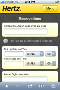
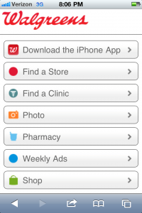
 Jason F. writes “I recently saw you speak at Conversion Conference. (I was at eMetrics and crashed your session.) We’ve got an iPhone app (it’s not getting any traction) and a full-blown mobile site that we spent about a million dollars developing. (Don’t ask, you won’t approve.) We’re not getting many orders and a lot of our users are bouncing off the first page. What are we doing wrong? I know you said that people need to mobilize their sites, not miniaturize them. We made the mistake of miniaturizing which we know we need to fix but it’s a huge process. What can we do in the meantime? You got any advice for us?”
Thanks for writing Jason.
Here’s the thing…
A lot of people are doing exactly what you did with mobile. They are taking their big site with bazillions of products/services and they’re smushing it down into a little site. That strategy, although convenient, doesn’t work for the user.
The good news is that you can fix it.
One of the best things about this new mobile world is that customers are extraordinarily forgiving, so here’s what you can do.
First, optimize your speed. Right now, it’s one of the only things that matter. Mobile users will not wait 15 seconds for your site to download. Period. End of story. Your goal, whether or not you choose to accept it, is a low page weight. (Under 100K, preferably closer to 10K.)
 Second, develop a killer entry page. This will make a huge difference in your success. Why? Because the first page that the user sees has a direct indication on their conversion success.
How do you do this? Be clear about your goals. What’s your goal? Branding? Acquisition? Engagement? Retention? Customer service? Sadly, it’s very unlikely that it will work the same as your traditional site – in fact, it’s often polar opposite.
If your site is an ecommerce site, then make it look like an ecommerce site from the get-go (you know, with things like a perpetual shopping cart.) If you’re trying to get something else, focus on it.
Focus on one thing — the lead, the order, the email address – whatever is THE thing that you want. The most successful companies in the mobile space, live and die by their funnels. They know what their end-goal is so they can work backwards accordingly.
Jason, you have an existing site that you spent a boatload of money on but even if you hadn’t, the key is to figure out what you want in the end (orders, inquiries, customer service, etc.) and then develop a plan to get to it. It sounds very simplistic but that plan starts at the very first page of your mobile site.
 Are people clicking on your store locator? Are they signing up for a catalog? Trying to purchase something? Adding themselves to your email list? Tracking their packages? Comparing prices? Reading the user reviews? Downloading a white paper?
Remember, this is somewhat of a self-fulfilling prophecy (when it comes to navigation, you get what I give you) so choose your topics carefully.
Pick the things that are most important to you, showcase them appropriately (you have room for about 5-8 solid choices) and then track the hell out of your results.
I realize that this sounds overly simplistic but developing a killer entry page is one of the very best ways to get a good foundation that you can build on.
Have a question you’d like answered? Click here now. It’s FREE!
Leave a Reply