 This is part 1 of a 5-part series. Part 2 can be found here. Part 3 can be found here. Part 4 can be found here. Part 5 can be found here.
1. Determine your REAL abandonment rate. I do a lot of speeches/webinars on abandoned carts and EVERY TIME I am finished, at least one person comes up to me and says something like “we have a 17% abandoned cart rate so I know we don’t have a problem with abandoned carts but —-.” I usually cut them right off at the “but.” Why? Because if your abandoned cart rate is only 17%, you are probably not getting enough people to adopt to cart. In other words, people on your site aren’t starting enough baskets. Before you begin an abandoned cart program, you need to know where your abandons are happening. On the view cart page? In the checkout? On the product page? (Most folks make the mistake of not looking closely at the product pages. The real challenges often start there.)
2. Next, figure out exactly which step(s) people are abandoning on. We tend to look at the pages that folks are stopping at but we don’t look at where they’re stopping. So, if you know that a lot of people are exiting without filling out your entire payment page, look at exactly which step they are leaving on. Perhaps the CID number is confusing them. Maybe you have too many payment alternatives and they don’t know which one to use. Whatever the reason is, you can’t fix it unless you know what it is so do a little digging and find out the info. (By the way, there are lots of ways to find this out – server calls, time trials, with a package like TeaLeaf (pricey but one of my favorites) or ClickTale (does the trick especially if you click here now to sign up for a FREE account) and so on.)
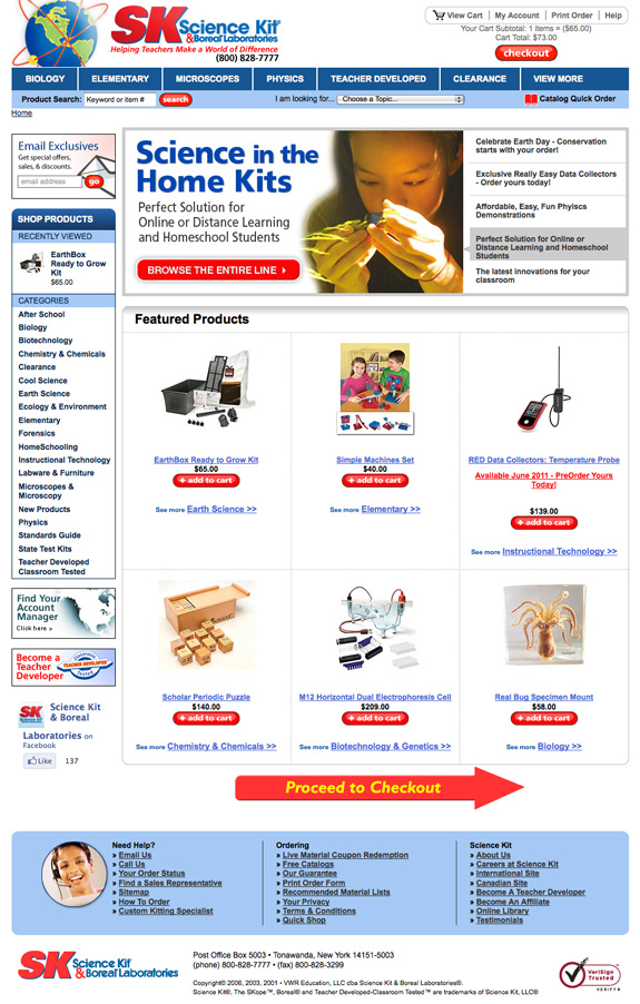
 3. Develop a perpetual cart. These days, everyone and their duck wants a popcart. (See Harry and David for an example.) Granted, popcarts are WAY sexier than perpetual carts but unfortunately, depending on your audience, they’re not always as effective when it comes to adoption or overall conversion. What’s in a perfect perpetual cart? A cart icon, a 100% secure shopping guaranteed tag (if you have it, of course), the number of items in the cart, the dollar value of what’s in the cart and links to view cart, print cart, email cart or save cart. Most important, add a big CHECKOUT NOW button to your perpetual cart when the first item is added to the cart.
4. Put your perpetual cart in more than one place. The best place for your perpetual cart is the top upper righthand corner of your website. However, there’s no rule that you can have only one perpetual cart per page. In fact, companies with high checkout impressions often have 2, 3 or sometimes even 4 perpetual carts. Where do you put them? Put one in the righthand column (should be in the middle-ish of your righthand column) and one in the bottom column. (The bottom perpetual carts tend to work best when placed in the center.) If you decide to add a 4th, put it in the lefthand column after your store index. (It can be above or below your About Us section.)
5. Try using CHECKOUT NOW buttons or arrows. You need to test these (they work well for about 85% of companies.) These should be in the top and/or the bottom of the middle column. Why would you put these on your site? Well, research has shown that after the first page, the user tends to look down the middle column. They look to the left when they need help and they look to the right when they are about to leave. Thus, BIG, SMACKY, IN-YOUR-FACE buttons focus your user on the most important task at hand – paying you! (You’ll find a good example below.)

Great stuff! Waiting for your next post!