Amy Africa's QLOG

99% queries & quintessentials. 1% quibblings

  • 
  • 
  • 
  • 
© 2009-2025 Amy Africa's QLOG

Powered by Genesis

30 Proven Tips for Reducing Your Abandoned Carts, Part 4

10:07 am by Amy Leave a Comment

This is part 4 of a 5-part series.  Part 1 can be found here.  Part 2 can be found here.  Part 3 can be found here.  Part 5 can be found here.

21. Offer a guest checkout.  This is a must-have for EVERY checkout.  Why? Generally speaking, about a quarter to a third of your users will prefer a guest checkout even if they have ordered before or are registered at your site.  Why? Because sophisticated users think it’s faster.  (Sophisticated users are people who do a lot of ordering online.)  Offering a guest checkout improves overall conversion and it reduces abandoned carts.

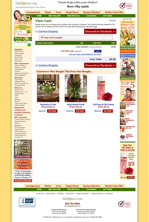
22. Determine whether or not you need a View Cart page.  The View Cart page is a landmine for a lot of ecommerce companies and frankly, it’s not always a necessity (especially if you don’t have a lot of items per transaction.)  Test whether or not you need one.  If you need one, figure out how you can reduce your abandons on it by simplifying the page, using exit pop-ups, using live chat/help, etc.

23. Speaking of View Cart pages, are you upselling on your view cart page?  It may not be the place for it.  Upsells in the cart can add 15-30% to your order if you position them properly.  Sometimes they work on the View Cart page and other times, they increase your abandons.   You won’t know till you start test it.  Don’t know where to test first?  After the Welcome Page or before/after the payment page are good places to start.

24. Reduce/limit navigational elements in the checkout.  Too many carts have all sorts of distractions – checkouts are not the place to give people reasons to leave – you want to keep them focused on THE goal which is to complete their order.  Streamline your navigation to keep only the things users MUST HAVE to complete their order.

25. Show payment method icons.  Use the MasterCard, Visa, American Express, Discover, etc. logos.  Put them in the order of importance. (In other words, rank them by your visitors use.)

26. Collect secondary email addresses.  It should be an optional field (do NOT require it) but try to obtain an additional email address.  You should get about 30% of the people to give you an alternate address.  (Great for testing thrust and trigger emails!)

27. Collect mobile numbers and ask if you may text message them.  You may not know how to use text messaging now but there’s a very BIG chance that you will so now is the perfect time to start capturing them!

28. Test proactive (instigated) chat.  Chat will work in your checkout.  It takes time but it will work.  (You really need to give it 6-9 months before you start making judgments on its efficacy.)  You can start with either live chat (where the customer contacts you) or instigated chat (where you contact the customer.)  Most companies find that it’s easiest to control instigated at the beginning because you can be there when you want to be (or when you have capacity.)  The key to making any kind of chat work is to put the right reps on it – assigning your best customer service people to chat is often a colossal bomb.  Just because someone is fantastic at chatting on the phone doesn’t necessarily make them a good writer or an efficient salesperson.

29. Can’t handle any kind of chat right now?  At least try Click To Call.   Remember, for the most part, web people want to place their order online without impediments.   When your website is “broken” (users think anything that doesn’t work the way they think it should is “broken”) users will give you one last shot – that’s why it’s beneficial to put your phone number and email address all over the place.  Click To Chat is one of those last-chance kind of things.

30.  Speaking of calls, test abandoned cart telemarketing.  No, you don’t need to do it on every order.  Start with your largest orders and work backwards.  (This tends to be a HIGHLY profitable strategy so there’s a big chance that your program will keep expanding.)
Filed Under: Shopping Carts

30 Proven Tips for Reducing Abandoned Carts, Part 3

12:30 pm by Amy Leave a Comment

This is part 3 of a 5-part series.  Part 1 can be found here.  Part 2 can be found here.  Part 4 can be found here.  Part 5 can be found here.

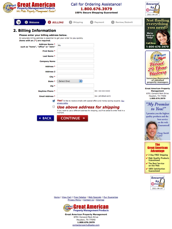
11. Use a temperature bar.  Yes, they’re ugly.  Deal with it.  Users like temperature bars because they set expectations.  Some checkouts are 11 steps and others are 1 so folks aren’t really sure what they’re getting into – temperature bars show them how many steps there are so they know how much longer they have left.  

Don’t want a temperature bar because it’s not aesthetically-pleasing?  Research has repeatedly proven that users who know where they are in the process have a better chance of converting.  Not only that but the further they get into the process (read: the more the temperature bar lights up), the higher their propensity is to finish the process.  In other words, the closer they are to a known completion, the less chance they have of abandoning.

12. Format your fields vertically.  City,state, zip should be on three lines, not one.  Why?  A couple reasons.  First, vertical aligned fields produce fewer errors.  Second, users often think that they’re “moving faster” when the fields are vertical.  This is important because speed and and security both factor prominently into your users checkout experiences.

13. If there’s only one choice, don’t use a dropdown.  This is one of those little things that everyone thinks is innocuous that’s not.  In a typical user’s mind, one choice in a dropdown equates to something “broken.”   Anytime something’s “broken” on your site, users leave.  En. Masse.

14. Review your error handling.  On average, we lose about 13% of people from checkout due to poor error handling.  About a third of the time this happens because users don’t can’t figure out where they screwed up.  About 20% of the time, it’s because our messages are “rude.”  Remember, if/when anything bad/wrong happens in your checkout it’s YOUR fault – whether or not your user is a complete idiot.  (Rule of thumb, tell the users their mistakes all at once and clearly delineate the field(s) they need to fix as well as how they need to fix them.  This is especially applicable if you have mobile traffic.)

15. Address privacy and security.  This doesn’t mean that you should make your site look like a Girl Scout’s sash with a bazillion and one badges all over the place.   (That technique usually hurts WAY MORE than it helps.)   However, you should promote your security (i.e., 100% secure shopping guaranteed or whatever it is that you offer) in the righthand column and at the bottom.

16. Include your full contact information.  Make sure your phone number is seen in at least three areas (top, right and bottom) and be sure to showcase your complete contact information at the bottom.  You don’t need to make a big deal of it but it should be there.  Include your address, fax number, email address and phone numbers.  If you get a lot of international orders, you should also consider offering a number that’s NOT toll-free.

17. Use a picture of a person in the righthand column that you’d give your money to.  Let me clarify that, someone who looks trustworthy (think Santa Claus or Wilford Brimley), not a hooker or a bailbondsman!  If you are going to use a customer service person, consider using one of your reps, not a stock photo.

18. Use BIG buttons, the bigger the better.  Make the biggest buttons you can and then double the size!

19. Weight your buttons.  If you have “continue shopping” on the left and “PROCEED TO CHECKOUT NOW” on the right, the “proceed” button should be BIGGER than the “continue” button.  Consider using different colors for the various buttons – and please, stay away from white or gray buttons.

20. Promote your guarantee in the righthand column.  (That’s where it tends to work best.  Should go underneath the customer service plug (telephone number and picture of person.)

Filed Under: Shopping Carts

30 Proven Tips for Reducing Abandoned Carts, Part 2

10:14 am by Amy 2 Comments

This is part 2 of a 5-part series.  Part 1 can be found here.  Part 3 can be found here.  Part 4 can be found here.  Part 5 can be found here.

6. Develop the Perfect Multi-Step Checkout. I know.  I know.  One-page checkouts are all the rage.  Why on earth would I recommend a multi-step?  Lots of reasons.  One-page checkouts don’t work for everyone.   I mean, if someone wants your product badly enough, they’ll force themselves through any kind of checkout (hello Yahoo stores) but the reality is that you should cater your checkout to your users on an individual basis – sometimes that’s a one-page checkout and sometimes it’s a multi-step checkout.   Plus, one-page checkouts don’t always give you an accurate indication of what’s not working in your checkout.

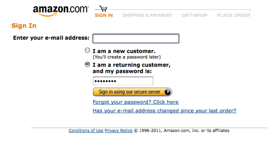
What’s a good multi-step checkout?  The most successful multi-step checkouts are usually five pages: Welcome, Bill To, Ship To, Payment, Confirmation.   You can test other variations but if you don’t have a good place to start, start with the one above.

7. The Welcome Page is the most important, ESPECIALLY if you don’t have the user’s email address.  The purpose of a welcome page?  To collect the user’s e-mail address so if they abandon at any point from then on, you can send them abandoned cart trigger emails.   Need another reason to keep your Welcome Page simple and to the point?  Research has repeatedly proven that the faster the user thinks your checkout process is, the likelier he is to finish it.If you master your multi-step and one-page checkouts, then you can work on your one-click-type checkout.   Single-step checkouts are great for items that are ordered consistently (consumables like ink cartridges, for example.)   Why doesn’t everyone have a single-step checkout?  Most of the reasons center around security, especially payments.   Single-step checkouts are NOT recommended for people who don’t excel security-wise.

8. Ask No Irrelevant Questions. Folks abandon carts and checkouts for a lot of reasons.  One of the biggest roadblocks to getting through a checkout?  A lot of trivial/unimportant questions.   Remember, relevancy is in the mind of the user.  So even though you may think a drop-down with 25 choices of
“where did you hear about us?” or “how many employees does your company have” is effective, chances are it’s not when it comes to the user.   Recommendation: save anything that doesn’t specifically pertain to the order till after they’ve hit the “complete my order” button.  You can ask the user whatever you want afterwards – in pop-surveys, follow-up emails, on the confirmation page, etc.  (If you must ask irrelevant questions in the checkout, don’t make them mandatory so if the user chooses not to answer them, they can still complete their order.)

9. Use pop-ups on exit. Yeah, yeah, I know.  Everyone hates pop-ups.  I’ve heard it all before.  Do yourself a favor and try them anyway.  I mean really, the people are LEAVING your site anyway. What do you have to lose?  Pop-ups are very dependent on creative so test 3-4 versions to determine which one(s) work best for you.   (More on pop-ups can be found here.)

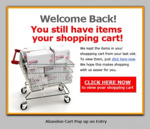
10. Use catfishes, midis, windowshades on repeat. VERY few people do this and it always blows me away.  Someone abandons your cart, comes back two days later and what do they get?  Dirt squat.  Try welcoming your users back with a pop or bar that reminds your user that they have something in their cart and gives them an easy way to get right back to it.

Filed Under: Shopping Carts

30 Proven Tips for Reducing Your Abandoned Carts, Part I

10:40 am by Amy 1 Comment

This is part 1 of a 5-part series.  Part 2 can be found here.  Part 3 can be found here.  Part 4 can be found here.  Part 5 can be found here.

1. Determine your REAL abandonment rate. I do a lot of speeches/webinars on abandoned carts and EVERY TIME I am finished, at least one person comes up to me and says something like “we have a 17% abandoned cart rate so I know we don’t have a problem with abandoned carts but —-.”  I usually cut them right off at the “but.”  Why?  Because if your abandoned cart rate is only 17%, you are probably not getting enough people to adopt to cart.  In other words, people on your site aren’t starting enough baskets.   Before you begin an abandoned cart program, you need to know where your abandons are happening.  On the view cart page?  In the checkout?  On the product page?   (Most folks make the mistake of not looking closely at the product pages.  The real challenges often start there.)

2. Next, figure out exactly which step(s) people are abandoning on. We tend to look at the pages that folks are stopping at but we don’t look at where they’re stopping.  So, if you know that a lot of people are exiting without filling out your entire payment page, look at exactly which step they are leaving on.  Perhaps the CID number is confusing them.   Maybe you have too many payment alternatives and they don’t know which one to use.  Whatever the reason is, you can’t fix it unless you know what it is so do a little digging and find out the info. (By the way, there are lots of ways to find this out – server calls, time trials, with a package like TeaLeaf (pricey but one of my favorites) or ClickTale (does the trick especially if you click here now to sign up for a FREE account) and so on.)

3. Develop a perpetual cart. These days, everyone and their duck wants a popcart.  (See Harry and David for an example.)  Granted,  popcarts are WAY sexier than perpetual carts but unfortunately, depending on your audience, they’re not always as effective when it comes to adoption or overall conversion.   What’s in a perfect perpetual cart?  A cart icon, a 100% secure shopping guaranteed tag (if you have it, of course), the number of items in the cart, the dollar value of what’s in the cart and links to view cart, print cart, email cart or save cart.   Most important, add a big CHECKOUT NOW button to your perpetual cart when the first item is added to the cart.

4. Put your perpetual cart in more than one place. The best place for your perpetual cart is the top upper righthand corner of your website.   However, there’s no rule that you can have only one perpetual cart per page.  In fact, companies with high checkout impressions often have 2, 3 or sometimes even 4 perpetual carts.  Where do you put them?  Put one in the righthand column (should be in the middle-ish of your righthand column) and one in the bottom column.  (The bottom perpetual carts tend to work best when placed in the center.)  If you decide to add a 4th, put it in the lefthand column after your store index.  (It can be above or below your About Us section.)

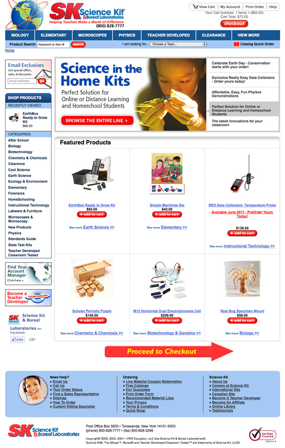
5. Try using CHECKOUT NOW buttons or arrows. You need to test these (they work well for about 85% of companies.)  These should be in the top and/or the bottom of the middle column.  Why would you put these on your site?  Well, research has shown that after the first page, the user tends to look down the middle column.  They look to the left when they need help and they look to the right when they are about to leave.  Thus, BIG, SMACKY, IN-YOUR-FACE buttons focus your user on the most important task at hand – paying you!  (You’ll find a good example below.)

Filed Under: Shopping Carts

Money Right Before Your Eyes: Abandoned Cart Programs

12:59 pm by Amy 1 Comment

It amazes me how many companies still don’t have abandoned cart programs.

Sure, a lot of folks send out ONE e-mail but an e-mail is not a program. A single e-mail is just so, well… half-hearted.

Your abandoned cart program should start the minute people leave your checkout with a pop-up. If you are morally (cough!) opposed to pop-ups, you can use a midi or a catfish, just make sure you use something. The purpose of the pop-up is to collect the user’s e-mail address. If you already have their e-mail address, you don’t necessarily need to use a pop-up although many companies have found that the “STOP! You still have xx items in your cart!” does prevent a significant group of site visitors from leaving. (By the way, pop-ups are completely dependent on creative — so if your copy and art is not compelling, your pop-ups won’t work.)

After you’ve collected the user’s e-mail address, it’s important to dump them immediately into your abandoned cart e-mail program.

The best abandoned cart e-mail programs are a series of 5-6 (often times more) e-mails. As with most triggers, most of the success of your abandoned cart e-mail will come from the things “outside the envelope.” This includes the to address, from address, subject line, preview panel, format and deliverability. Inside, it’s important to make the e-mails look as one-to-one as possible. Personalize the e-mail with their name and the contents of their cart, if you can. (This works well with thumbnails.)

It’s important that you put the phone number in your e-mails several times. The abandoned cart  e-mails that work have big action buttons (RETURN TO MY CART NOW!) and lots of phone number plugs.

Whether or not you use an offer is up to you. Offers work — mostly because deadlines create urgency and cause people to focus — but you definitely don’t have to use them to have a good abandoned cart program. If you are going to use offers, you don’t need to use them on the first couple of e-mails. You can but they will work just fine sans discount/bonus. (If they don’t, you need to tweak your messaging.)

Timing is one of the most important variables when it comes to abandoned carts. You should definitely test the timing as every company has it’s own magic formula for what works. However, if you need a place to start, send out the first e-mail immediately (within 2 hours.) Send the second out in 24, the third out in 48, the fourth out in 5 days and the fifth out in 7-8 days. Review the results in 10-14 days and adjust accordingly.

What happens when the user comes back? One of the best techniques is to offer a catfish or a midi reminding the user that there’s something in their cart. You can also test taking the user directly to their cart but often times it won’t work as well as a catfish or a midi likely because your checkout doesn’t look the same as the rest of your site. (Familiarity is very important to users.)

Filed Under: Shopping Carts

Are One-Page Checkouts THE Best Practice?

3:19 pm by Amy 1 Comment

Kyle Nelson says: “I attended your shopping cart webinar a couple weeks ago. During your presentation, you said that one-page checkouts are not for everyone.  Our provider said you don’t know what you are talking about and that one-page checkouts are the new best practice. Which one of you is right?  Oh, I forgot to mention, he wants to charge us $7,500 per site to develop ours (we have eight sites) so he has a vested interest.”

Hi Kyle.  Thanks for writing.  Here’s the thing.  One-page checkouts will work extraordinarily well for certain users and for others, they will completely bomb.  Some will fall right in the middle.  You won’t know till you test it.

In other words, looking at one set of A/B split test results from a site that sells anabolic steroids to Jordanian bodybuilders (a similar case study to the one your provider is using in his collateral material) and making your assumptions from that is a terrible, horrible, no-good very bad idea.   (And yes, as much as I think those sites that give you information on which test(s) performed best are sexy and fun to read, they are not a sure-fire recipe for success.  Take it from someone who happily admits that she tests more things that fail than things that succeed.)

If you are interested in a one-page checkout, test it with the people who know you first – your registered users and past customers.  Make sure you have enough statistical significance in your results – if your one-page checkout gets 21 orders and your old checkout gets 22, it’s not necessarily a winner.  (Online you need the variances in checkout tests to be much higher – usually two or three times that of offline tests.  If you want the results to stick that is.  Oh, and always backtest the old control at least once with anything concerning forms and/or checkouts.)

If that is successful, you can start rolling it out with other segments.  I would never globally implement a one-page checkout to all your folks.    Some people do it.  I don’t think it’s the best idea ESPECIALLY if you have catalog customers coming in from offline sources as they often need a completely separate checkout OR if you are doing a lot of work with PPC or affiliates OR…. Well. You get the idea.  I’ve just seen too many examples of where it hasn’t worked to be completely enamored with it.   (By the way, I want to be clear that I am a proponent of and do recommend one-page checkouts, I just think you need to be very disciplined in your offerings.  Your users will tell you what is best for them.  Don’t force what you think is best just because it’s the “in” thing.)

One of the points to keep in mind with one-page checkouts is  that you really need to do server calls (or something similar) so that you can keep track of the information that you do get from the user.  A lot of times companies will feel that their one-page checkouts are stellar until they realize that they have collected very little data to use for their abandoned cart e-mails and programs.  If you are doing things right online (best practice or not), you are going to save 15 to 50% of your abandoned carts.  (And no, you don’t need a discount or free offer to make an abandoned cart program work.)

P.S.  As for your provider, I think you should tell him that charging you $7,500 for each site when he’s implementing the exact same checkout is highway robbery, which in fact, is NOT a best – or even good — practice if he wants to keep his clients, exactly 42% of which I have sent him, I might add.

Filed Under: Shopping Carts