Amy Africa's QLOG

99% queries & quintessentials. 1% quibblings

  • 
  • 
  • 
  • 
© 2009-2025 Amy Africa's QLOG

Powered by Genesis

How To Axe 90% of Your Website Project List

4:33 pm by Amy 4 Comments

Betsey Kendall writes: “The Web Show was the first place I ever saw you without your bodyguard so I patiently waited in line to ask you a question but then I got interrupted by a phone call.  When I turned around, you were gone! We are struggling with our project list.  You said in your seminar this is a common problem and that ‘90% of your stuff should be axed.’  Can you talk a little bit more about that? Your point about emails was VERY well taken by my team.”

Hi Betsey –

My bodyguard?  You must mean my friend, Cristina.  Yeah, she’s tough.  Not physically. She can’t hurt a flea but that one-eyebrow-raise of hers?   VERY. SCARY.

Glad you took my point about emails seriously.  It blows my mind how many people spend 10-15 hours on a single thrust email, moving things back and forth two pixels – COMPLETE WASTE OF TIME.  If you’re spending more than a couple hours on any email, you need to rethink your strategy.

As for the axing….  Everyone and their brother – whether they have a full-blown ecommerce site or a blog — has a HUGE list of things that they want to do.  My experience is that the majority of that stuff is not going to make a difference — nor will it ever really get done.  So the best thing to do is put your list into a spreadsheet and then rank it.  (At Eight By Eight, these are one of the most popular things we do for clients.)

So, for example, let’s look at one item:

AREA:                                   Improve product detail pages

INITIATIVE:                  Develop recently-viewed items banner (so users know what they’ve looked at)

PRIORITY:                        1 (we rank things 1-3 with 1 being the highest)

EASE TO CHANGE:     1 (we rank things 1-3 with 1 being the easiest)

COST:                                    L (we use high, medium and low)

ROI:                                       M (we use high, medium and low)

TIMING:                            S (we use short and long-term & we define the days associated with each, for example, short-term in this case might be 120 days)

We may also add internal time, date completed and who is responsible.

After everything is put on the list, we sort by rank and then the appropriate (ease to change, cost and ROI) field(s.)

This sounds boring as Hell but it’s one spreadsheet and it makes things super easy and VERY efficient.  All the low ROI items?  You guessed it.  They get sorted right off the list!  And for most companies, that accounts for about 90% of the stuff they want to do!

Is this system perfect?  No.  But it works.  A lot of web stuff never gets done (i.e., improving your internal text search or testing email pop-ups) because the project itself seems too big.  So, we take care of the easy fixes like changing colons to semi-colons that Customer Service is nattering about instead.  Sadly, even though that kind of stuff seems productive, it usually doesn’t result in more sales or leads.

Have a question about your project list?  Jot it in the comments below or send me an email to info@amyafrica.com.
Filed Under: Strategy

8 Proven Tips for Increasing Your Email Capture Rate Using Pop-Ups

6:39 pm by Amy 6 Comments

Tim writes “I attended your lunch thing at NEMOA and I was very interested in what the guy from The Golf Warehouse said about pop-ups.  I hate those {redacted} but when I heard what you two said about them, especially what the golf guy said about them, I figured I should test them on our site.  What can you tell me about them?”

Hi Tim:

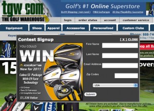
Yes, Brad (the golf guy) was fantastic.  He used to work at Orvis (they’d rather rather go out of business than “sell” someone) so I think www.tgw.com was probably quite the culture shock for him.  (The Golf Warehouse is VERY aggressive, which I LOVE.)

They do a sweepstakes pop-up.

Sweepstakes pop-ups work well because of the offer (obviously) but also because you can do them over and over.  Some folks will come back every month to sign-up again – it’s sort of like FREE ECOA (email change of address!)

Not everyone can do a sweepstakes though so if you can’t, you can offer a free info download (for example, 23 FREE tips for improving your garden!) 

If you don’t want to do anything, that can work too depending on your creative.

The thing about email pop-ups (or any kind of banner for that matter) is that they’re highly dependent on creative.  So if your pop-up doesn’t work it’s most likely because your creative SUCKS.   (Good creative on pop-ups is dependent on the copy and art AND most important, the action directives.)

What else should you know about pop-ups?

Once the user has closed them, keep them closed.  Don’t open the pops over and over on every page, till you’ve tested it.

Test different sizes and shapes.  You never know what will work best for you till you test it.    

You should also test the location.  Sometimes pops work in the upper left.  Others they work in the middle or lower right.  Once you’ve gotten really comfortable with your creative, test the place you put it.

Always make sure the way to close the box is clear.  Some “experts” tell you to bury the close but it’s not the best strategy.  It may work overall – in terms of better sign-ups, but it often impacts your other steps of the sale.

ALWAYS keep a sample of people who don’t get the pop-ups.  It doesn’t need to be a big sample, but you should have one.  Why?  Surprisingly it’s the best indicator when things go wrong with your pop-ups.

Develop 2-3 different pop-ups.  One of the things that folks don’t typically do is deal well with the repeat visitors.  If someone comes to your site and gets one pop-up, the next time they visit you can show them a completely different pop-up to see if they respond to that.  You should also test ONLY showing one pop-up per series of visits.  A series generally lasts 21 or so days.

Work the capture box.  Many email capture pop-ups fail at first because people make the capture box (where you put your address in) too small.  I know that capture boxes aren’t pretty but it’s important that they are big and easy to use.  Don’t forget an action button.

Work your landing pages.  Once someone has given you their email address, make sure to thank them and then tell them what to do next.  The confirmation pages are often as important, if not more important, than the capturing itself.

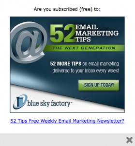
It’s important to note that email pop-ups work for all sorts of sites – not just ecommerce sites.  They’re good for service sites and blogs alike.  Christoper Penn (aka @cspenn) writes about his personal blog pop-up experiences here.)  To the left, you’ll see the pop-up they use on Blue Sky Factory where Chris is a VP.  This is a VERY solid pop-up, especially the SIGN UP TODAY button.

Have more questions about email capture pops?  Jot them in the comments below or send me an email at info@amyafrica.com.

Filed Under: Email Marketing

30 Proven Tips for Reducing Your Abandoned Carts, Part 4

10:07 am by Amy Leave a Comment

This is part 4 of a 5-part series.  Part 1 can be found here.  Part 2 can be found here.  Part 3 can be found here.  Part 5 can be found here.

21. Offer a guest checkout.  This is a must-have for EVERY checkout.  Why? Generally speaking, about a quarter to a third of your users will prefer a guest checkout even if they have ordered before or are registered at your site.  Why? Because sophisticated users think it’s faster.  (Sophisticated users are people who do a lot of ordering online.)  Offering a guest checkout improves overall conversion and it reduces abandoned carts.

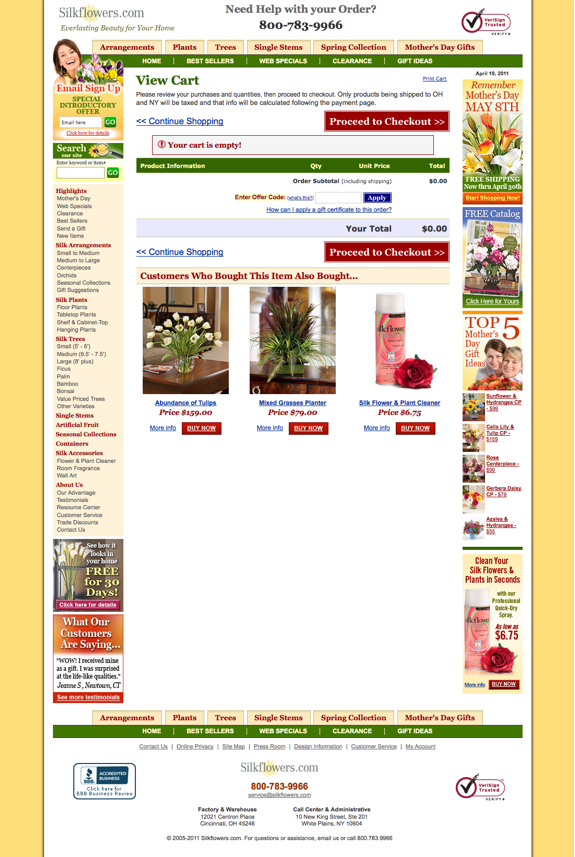
22. Determine whether or not you need a View Cart page.  The View Cart page is a landmine for a lot of ecommerce companies and frankly, it’s not always a necessity (especially if you don’t have a lot of items per transaction.)  Test whether or not you need one.  If you need one, figure out how you can reduce your abandons on it by simplifying the page, using exit pop-ups, using live chat/help, etc.

23. Speaking of View Cart pages, are you upselling on your view cart page?  It may not be the place for it.  Upsells in the cart can add 15-30% to your order if you position them properly.  Sometimes they work on the View Cart page and other times, they increase your abandons.   You won’t know till you start test it.  Don’t know where to test first?  After the Welcome Page or before/after the payment page are good places to start.

24. Reduce/limit navigational elements in the checkout.  Too many carts have all sorts of distractions – checkouts are not the place to give people reasons to leave – you want to keep them focused on THE goal which is to complete their order.  Streamline your navigation to keep only the things users MUST HAVE to complete their order.

25. Show payment method icons.  Use the MasterCard, Visa, American Express, Discover, etc. logos.  Put them in the order of importance. (In other words, rank them by your visitors use.)

26. Collect secondary email addresses.  It should be an optional field (do NOT require it) but try to obtain an additional email address.  You should get about 30% of the people to give you an alternate address.  (Great for testing thrust and trigger emails!)

27. Collect mobile numbers and ask if you may text message them.  You may not know how to use text messaging now but there’s a very BIG chance that you will so now is the perfect time to start capturing them!

28. Test proactive (instigated) chat.  Chat will work in your checkout.  It takes time but it will work.  (You really need to give it 6-9 months before you start making judgments on its efficacy.)  You can start with either live chat (where the customer contacts you) or instigated chat (where you contact the customer.)  Most companies find that it’s easiest to control instigated at the beginning because you can be there when you want to be (or when you have capacity.)  The key to making any kind of chat work is to put the right reps on it – assigning your best customer service people to chat is often a colossal bomb.  Just because someone is fantastic at chatting on the phone doesn’t necessarily make them a good writer or an efficient salesperson.

29. Can’t handle any kind of chat right now?  At least try Click To Call.   Remember, for the most part, web people want to place their order online without impediments.   When your website is “broken” (users think anything that doesn’t work the way they think it should is “broken”) users will give you one last shot – that’s why it’s beneficial to put your phone number and email address all over the place.  Click To Chat is one of those last-chance kind of things.

30.  Speaking of calls, test abandoned cart telemarketing.  No, you don’t need to do it on every order.  Start with your largest orders and work backwards.  (This tends to be a HIGHLY profitable strategy so there’s a big chance that your program will keep expanding.)

Filed Under: Shopping Carts

What are stick emails?

12:59 pm by Amy 2 Comments

Lisa Blitzer writes: “What is a stick email?  My email guy said our provider is insisting upon us doing one but I looked it up on Google and couldn’t find a thing so they must not be all that popular.  From the way my guy explained it, it sounds craptastic to me.”

Hi Lisa:

Ah…  Stick emails.   You’re right.  They suck.

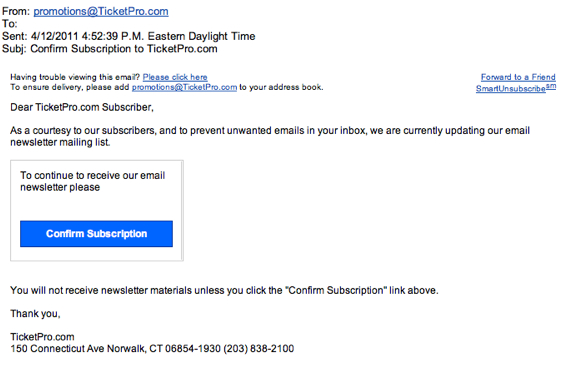
Stick emails (aka confirms or COE’s) are only called this by a few ESP’s which is probably why you couldn’t find information on Google.  Sticks are emails that you send out to get your subscribers to confirm that they want to be on your list.  Some providers make you email everyone and others make you mail only the inactive names (for example, people who haven’t opened or clicked on your emails within x months.)  Here’s an example of a stick email I recently received.  (For the record, I absolutely adore Carl at TicketPro – he’s one of the ONLY ticket brokers I’d recommend.  The fact that they sent out a stick email has no bearing on what I think of them as a company – they rock.)

Several of the free/cheap providers insist that you do them once or twice a year.

I am not a fan.  From my perspective, they’re terrible, horrible, no good, very bad things as I’ve seen a lot of companies lose 40 to 60 percent of their names by doing them.  In fact, I’ve even seen one company go from about 200,000 names to about 4,000.  Yes, 200K to 4K. 

Are they all that terrible?  No.  But I’d recommend doing things like ECOA (email change of address) instead.  Nobody wants to mail garbage names but there are lots of better ways to skin the cat than making everyone commit again.  Just ask married people if they’d do it all over again and watch them hesitate for a second!

If you must do them (as in your provider requires it), I’d recommend using an offer with a deadline.  I’m not a big fan of giving away money for nothing but you really need to pull out all the stops when it comes to saving your email addresses.  Deadlines create urgency and they cause people to focus.

Which brings me to one of the most frequently asked questions I get about stick e-mails – “my provider says these kind of emails only get rid of the junk names from my list and that they’re perfectly fine, why do you despise them so?”

Here’s the thing.  All providers lie through their teeth about their deliverability.  Yes, even the best ones.  Many of them don’t do this intentionally, the truth is that they just don’t really know what happens to your names once they get to the inboxes.  In other words, if my email is sent directly to your trash – it’s still delivered.  

If you send out an email that the user doesn’t receive, they can’t respond.  Obviously.  This is a big deal for stick emails because they are legal documents.  In other words, if I tell you that I won’t email you unless you say you want my emails, I have to abide by that.  If you don’t receive my stick email and thus don’t tell me?  Sorry about my luck – I technically should not mail you again.  (Thus my biggest problem with stick emails.)

By the way, remember, when you are sending out any email, spend some time on the things that are “outside the envelope.”  (This includes the to address, from address, subject line, format and you guessed it, deliverability!)

Have a question about sticks?  Jot it in the comments below or email me at info@amyafrica.com!

Filed Under: Email Marketing

Towanda & the Gentle Art of User Linking

9:18 am by Amy 3 Comments

Have you seen the movie Fried Green Tomatoes?

Do you remember the part with Evelyn Couch (played by Kathy Bates) in the parking lot? 

Here’s the gist…  Evelyn is waiting patiently for a parking spot when two young girls steal it.  (“Face it lady, we’re younger and faster!”)  Livid, Evelyn says “Towanda!” and then crashes her big ole’ boat of a car into their little VW bug.  Repeatedly.  (“I’m older and have better insurance.”)   

Fast forward to a couple days ago…

I was running through the parking lot.  I stopped to tie one of my sneakers and as I was crouched down, I saw a bumper sticker that said “Taxes are the privilege of a civilized society.”

Granted, I was in a cranky mood and it doesn’t help that it’s tax season (I’d prefer root canal without anesthesia through my belly button to paying taxes) but seeing that bumper sticker made me want to go all Kathy-Bates-Towanda on the car.   Just call me Fists o’ Fury.

As I was looking around for unlocked cars (my diabolical plan was to pop a trunk, steal a tire iron and smash all Civilized Society’s windows  in an “I don’t know if I’m older but I guarantee I have better lawyers” kind of way), I noticed that good ole’ Civilized had two other bumper stickers.  One said: “Co-Exist” and the other said “my website is” www.{NameRedacted}.com. 

My website is www.{NameRedacted}.com.*

WOW.  Can you imagine the linking on that? I thought to myself.

Then, I remembered I had five “Ask Amy” questions on just that very topic that I needed to answer.

Turns out there is a lot of confusion on linking.  What it means and how it works.

Even if your mobile site is completely flawless – as in THE best, most perfect site ever – chances are that you will get the majority of your mobile leads or sales through other channels (email, phone, text message, your traditional website, etc.)   Yes, this will change but as of today, it’s more than likely that your users are going to buy/book/sign-up/register/order in or on one of your other channels.

Not to mention there are countless scenarios such as this – I take a picture of your product with my phone.  I send it to you.  I get a text message back. I open the text message and click on the phone number inside.  I get IVR.  Someone sends me info to my email address.  I open my email at home. I click on your website from that email.  I order the product from your website.

Who gets the credit for this?  What source is it attributed to?  If I want more orders like that one, where should I spend the money?  

Companies who are trying to figure out the mysteries are looking at what we call user linking. 

In a nutshell, user linking tracks all the steps of the sale or lead.  Some analysts like to work from the end to the beginning and others find it easier to start at the beginning and try to piece their way to the end.  Whichever way you choose to do it, the only thing you should remember is that it’s not going to be perfect but whatever you cobble together is better than nothing.

There are lots of ways you can implement linking in your business.  Many folks who are first starting out find that they like to tie things together with email addresses and mobile phone numbers.  (If you’re not collecting mobile numbers, you should be, even if you don’t know how to use them quite yet.)  Again, is this perfect?  No.  But it’s a good start.

Can you ask the customers?  Yes.  It’s not the most accurate but it’s better than nothing.   What are the best ways to ask them?  Surveys work.  You can also ask them after completions – so after they’ve submitted their order or lead, you can ask them on the thank you page.  I would NOT recommend doing this in the middle of your lead forms or checkout – only at the end.  That way you’ll be certain that it will not increase your abandons.

What will linking help you with?  It’s one of the best ways to figure out where you should be spending more money.  It often tells you where you should spend less.

A lot of times we give the credit to the wrong place.  Linking doesn’t fix that overnight but it does help you get an idea of what kinds of contacts are involved in getting a sale or a lead.

It also helps you figure out where you need to nudge.  (Nudging helps reduce DTS.)  When you start looking at your linking you’ll begin to see places where users get stuck in your pipeline.  So, in the earlier example, if you send out 1000 text messages to users and none of them click on the links, you know you may have issues with your messaging (perhaps you aren’t using aggressive action directives.)  However, if a lot of people click on the link and call the number and then don’t do anything after that, you may have an issue with your phone messages or you may need to send them more than one trigger email.  (Many companies find that series of trigger emails work best when dealing with mobile users.)

Have anything you’d like to add about linking?  Please jot it in the comments below or send me an email at info@amyafrica.com. 

Oh, and as for my Towanda moment, it never happened.  I’d like to say that I was a better person and walked away silently but the truth is I was stopped by the grumpy man on my iPod who told me that my “pitstop time had ended” and that I needed to get back in gear.  

Getting bossed around by a piece of technology.  Just one of the many privileges of a civilized society.

*Yes, I know it’s wimpy to not list the site name but I am still getting enough hate-mail from people who think I’m racist or unpatriotic.   I don’t need more drama from the high priestesses of cosmetics.  Trust me, I’ve battled with those chiquitas before and it’s nothing but ugly.  Literally and figuratively.

Filed Under: Mobile

30 Proven Tips for Reducing Abandoned Carts, Part 3

12:30 pm by Amy Leave a Comment

This is part 3 of a 5-part series.  Part 1 can be found here.  Part 2 can be found here.  Part 4 can be found here.  Part 5 can be found here.

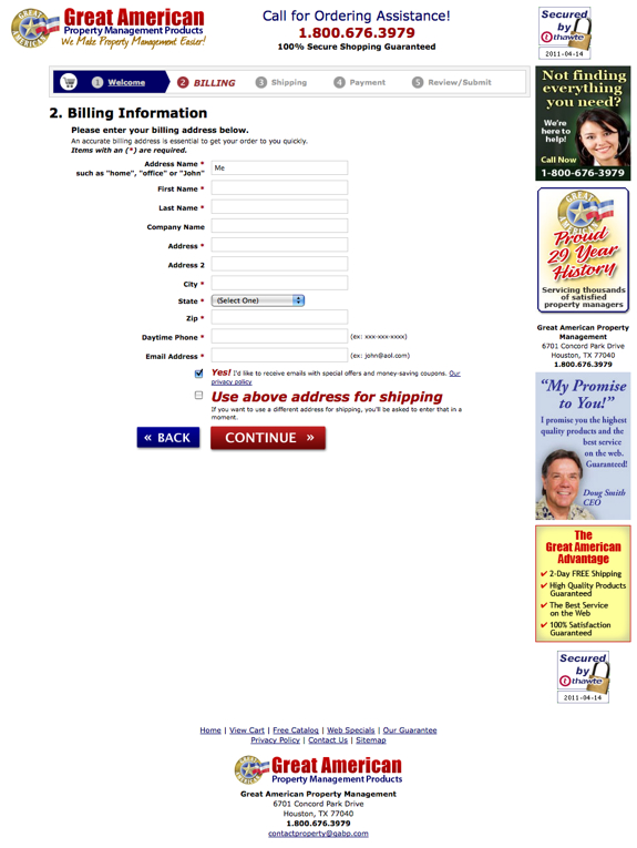
11. Use a temperature bar.  Yes, they’re ugly.  Deal with it.  Users like temperature bars because they set expectations.  Some checkouts are 11 steps and others are 1 so folks aren’t really sure what they’re getting into – temperature bars show them how many steps there are so they know how much longer they have left.  

Don’t want a temperature bar because it’s not aesthetically-pleasing?  Research has repeatedly proven that users who know where they are in the process have a better chance of converting.  Not only that but the further they get into the process (read: the more the temperature bar lights up), the higher their propensity is to finish the process.  In other words, the closer they are to a known completion, the less chance they have of abandoning.

12. Format your fields vertically.  City,state, zip should be on three lines, not one.  Why?  A couple reasons.  First, vertical aligned fields produce fewer errors.  Second, users often think that they’re “moving faster” when the fields are vertical.  This is important because speed and and security both factor prominently into your users checkout experiences.

13. If there’s only one choice, don’t use a dropdown.  This is one of those little things that everyone thinks is innocuous that’s not.  In a typical user’s mind, one choice in a dropdown equates to something “broken.”   Anytime something’s “broken” on your site, users leave.  En. Masse.

14. Review your error handling.  On average, we lose about 13% of people from checkout due to poor error handling.  About a third of the time this happens because users don’t can’t figure out where they screwed up.  About 20% of the time, it’s because our messages are “rude.”  Remember, if/when anything bad/wrong happens in your checkout it’s YOUR fault – whether or not your user is a complete idiot.  (Rule of thumb, tell the users their mistakes all at once and clearly delineate the field(s) they need to fix as well as how they need to fix them.  This is especially applicable if you have mobile traffic.)

15. Address privacy and security.  This doesn’t mean that you should make your site look like a Girl Scout’s sash with a bazillion and one badges all over the place.   (That technique usually hurts WAY MORE than it helps.)   However, you should promote your security (i.e., 100% secure shopping guaranteed or whatever it is that you offer) in the righthand column and at the bottom.

16. Include your full contact information.  Make sure your phone number is seen in at least three areas (top, right and bottom) and be sure to showcase your complete contact information at the bottom.  You don’t need to make a big deal of it but it should be there.  Include your address, fax number, email address and phone numbers.  If you get a lot of international orders, you should also consider offering a number that’s NOT toll-free.

17. Use a picture of a person in the righthand column that you’d give your money to.  Let me clarify that, someone who looks trustworthy (think Santa Claus or Wilford Brimley), not a hooker or a bailbondsman!  If you are going to use a customer service person, consider using one of your reps, not a stock photo.

18. Use BIG buttons, the bigger the better.  Make the biggest buttons you can and then double the size!

19. Weight your buttons.  If you have “continue shopping” on the left and “PROCEED TO CHECKOUT NOW” on the right, the “proceed” button should be BIGGER than the “continue” button.  Consider using different colors for the various buttons – and please, stay away from white or gray buttons.

20. Promote your guarantee in the righthand column.  (That’s where it tends to work best.  Should go underneath the customer service plug (telephone number and picture of person.)

Filed Under: Shopping Carts

More Sure-Fire Tips for Improving Your Remarketing Banners

11:22 am by Amy Leave a Comment

This is part 2 of a 2-part series about remarketing banners.  You can find Part 1 here.

If you’re testing a remarketing program for the first time, make sure you test it at the best time of your year.   A lot of companies test remarketing programs on their off-seasons thinking that it’s a good time because they’re not busy or they won’t “possibly do worse” at any other time of the year.  Although that may sound like a good idea it doesn’t really give you a good idea of your maximum potential or what you should budget annually.  

Choose your properties carefully.  There is a big difference between running your technology banner on HotMail and putting it on a tech news site.  Additionally, a lot of times the networks “fill” their different packages with less desirable (read: garbage) properties.  You’ll want to know exactly what you’re getting and more important, what is and isn’t working for your brand.  You may be surprised at what will work for you so try not to put a lot of names on your holdback list just because you personally don’t like them.  Remember, your network partners want this program to work for you.

Make sure you know which properties are in the group.  If your remarketing partner won’t tell you, make sure you are clear about what’s acceptable to you.  If you don’t want your banner on sites with adult content, you need to be specific about it.  The truth is that it’s not usually the adult content that marketers find offensive, it’s often some of the niche properties.   For example, a plus size clothing company was “shocked and appalled” to find out that their best performing site was for “fat chicks only.”  Funny thing is that when they surveyed their users, the users weren’t at all offended and actually thought it was “cool” that the apparel site was supporting one of their “favorites.”

Try for CPA deals.  All the networks yap about CPA (cost per action) deals but most of them offer them anyway.   Decide what you can pay per order, lead, e-mail sign-up, etc. and offer them a set fee for each action delivered.    Warning: most networks make their CPC (cost per click) deals sound very sexy.  That’s because they are comparing them to their pathetic CPM (cost per thousand) deals.  Setting your price via CPO (cost per order) or CPL (cost per lead) will be far easier (and more profitable) for you to manage if you know your numbers.

Determine how low you can go.  The thing about remarketing programs is that you have a lot of choices.  You can market to everyone from plain site exits to cart abandoners.  Best practice: test cart abandoners first and then work backwards.  As long as it’s profitable, it’s probably worth doing but again, it’s critical that you know your numbers.  (Emphasis on YOUR numbers not those provided to you by the partners.)

Make sure you have an exclusions program.   Chances are not all your transactions will take place in the first visit.  To maximize the success of your remarketing program, you’ll want to suppress people who’ve ordered.   A lot of companies forget this important step.  Don’t be one of them.  It’s a waste of your money and it confuses the heck out of your users.

Set aside a control group that you do not send to your remarketing partner(s).  Most partners will try to talk you out of this citing all sorts of conspiracy theories about aliens and Mayan calendars.  Ignore them.  Keep a small sample out of their remarketing efforts (yes, you should do this on an ongoing basis.)  Doing so has lots of benefits but the biggest advantage is that you’ll be able to see at-a-glance how you’re doing without the remarketing banners.  This is especially important if you have active trigger e-mail programs or internal remarketing programs (catfishes for example.)

Test cookie lengths.  How long do you want users to see your ads?  1 day?  7 days?  15 days? 30 days?  Indefinitely?   A lot of partners (even the good ones) won’t talk to you about this because they want to be able to run your ads forever.  However, it’s important for you to test different intervals to determine where your ads stop working or often more importantly, when you need to swap out your creative.

Remember that advertising within the Google Display Network is often very different from using other  remarketing companies (Fetchback, for example.)  If you’ve tried one type and it hasn’t worked for you, don’t be afraid to try the other.   In the end, this is nothing but a numbers game.

Don’t benchmark your results versus overall industry results to gauge the success of your program.   Everyday there’s a new blog post (usually ghost-written by one of the partners) about some random company that has increased their results 1200% using so-and-so’s unique retargeting methods.    There’s no doubt that this sounds sexy but the reality is that your business may not compare with the kids niche clothing company who is offering 50% off all their apparel this week only.   Too many successful campaigns are cut because they don’t meet industry standards.  The only standard you should care about is yours.  You can either make this work or you can’t.

Update your privacy policy.  No, this tip won’t make you money but it may help you from losing it.  You need to tell your users what you’re doing and you should also include a link for them to opt out of it.  (Google and many of the other partners require you to do this.  If your partner doesn’t, do it anyway, just to be on the safe side.)

Filed Under: SEO/SEM

10 Proven Tips for Improving Your Retargeting Banners

10:46 am by Amy Leave a Comment

Remarketing (sometimes called retargeting) banners put your message in front of users who leave your site and/or cart.  So, a customer goes to your site, looks around, puts stuff in her cart (or starts to fill out your lead form) and then exits for whatever reason.  A couple days later, she signs into her Yahoo mail account and sees your banner displayed at the top of her mailbox.  That afternoon, she sees your banner again on her favorite gossip site.  You are “following” her around.   (Usability shows us that this is what users often think.)

Are these type of retargeting banners effective?   Yes.  If you design your program correctly, they can be one of the strongest tools in your conversion arsenal.

Here are 10 proven tips to help you develop a successful retargeting program without breaking the bank.

Creative is key.  I can’t emphasize this enough. Banners are highly dependent on good copy and art.  You need to have solid visuals, a good branding element, a provocative line of copy and an aggressive action directive.   A lot of folks design banners that get attention but then they don’t ask the user to click.  If you want your program to work, you need to get the click.  Period.

How do you get people to click?  Use BIG action directives.   Click here now, buy now, return to cart now, whatever it takes to get the user back to the cart or lead form, if you’re not an ecommerce business.  Don’t be afraid to make your buttons bold and IN-YOUR-FACE smacky. 

Have lots of different ad sizes available.  A lot of companies, especially traditional direct marketers and mail order businesses, tend to offer their partners one ad size.  This often limits some of the smaller plays (especially blogs or Google Content Network properties) which may be the best performers for you.  Start your program out with 4-5 various sizes.

Test lots of different creative and sizes.  Most likely you’ll find that a banner that works great for one property bombs for the next.  Does that mean you need to have a new banner for each property?  Absolutely not.  With that said, you’ll probably want to design specific banners for your best performing properties in the same way you’d design special ads for your best performing magazines.

Don’t believe anything the networks tell you.   The numbers are inflated.  Period.  End of story.  What you need to know is the profitably of the program.  Does it work for you or not?  How profitable is it?  Are there better ways for you to spend this money?  The last question is important because if you have a really aggressive abandoned cart/lead trigger email/telemarketing/pop-up program, you may not need the banners.  Or, you may want to start them a little bit later (for example, after you’ve sent out your first five trigger e-mails.)

Test putting the picture of the product the user abandoned in the banner.   Yes, this is very Big Brother.  Yes, this can work like gangbusters if you position it properly.  Should you put the entire cart contents in the banner?  Probably not. Less than 5% (technically it’s about 3%) of companies can make featuring all the abandoned items work.  Why if you can make one picture of an abandoned item work can’t you make lots of items work?  Nobody really knows for sure but it’s likely because banners are very dependent on creative (see above) and lots of various and sundry items looks uglier than a dog’s breakfast.  If you want to test it, be sure that you can make one abandoned item per banner work first.

If you can’t put the abandoned items in the banner, at least choose your banner visuals wisely.  Imagine you’re an apparel company that sells both men’s and women’s clothing.  When a male abandons a tie on your site and then sees a banner for your company at his favorite news site with a bunch of women’s clothing, is he going to think of you?  Yeah.  Not. So. Much.

Test your offers.  One of the best things about retargeting banners is that they’re super easy to test.  Try different offers – free shipping versus a percentage off versus a discount versus no offer at all.

Make sure your logo (or primary site visual if that’s more important to your user) is prominent.   The connect from the banner to your site is important and not to be underestimated.

Work your landing pages.  Most companies forget about this and then blame their lack of remarketing success on the networks.  When the user clicks on your banner and lands on your site, you need to show them instantaneously that they’re in the right place.  How do you do that?  Take them right to the view page of the cart.  Offer a perpetual basket.  Show large checkout now buttons.  Place a recently viewed items box in the righthand column of your site.  Welcome them back with a personalized message.  Bring them to the page of the product they abandoned.   Do any/all of the items listed. 

Try several different networks.   Every network has different properties and/or relationships with their properties.  Test 3 or 4 at once to see which one(s) work best for you.  The companies who are most successful with their marketing often use several different networks.

Have a retargeting tip or a question you’d like to ask?  Add it to the comments below or send me an email: info@amyafrica.com.

Filed Under: SEO/SEM

What Are Mobile Diversions?

10:48 am by Amy Leave a Comment

Sarah Sans-Souci asks: “I was at a mobile conference recently and everyone was talking about diversions.  I’ve been in direct marketing for 30 years but I’m afraid I still don’t know what diversions are in a mobile context.  Please help!”

Hi Sarah –

There are a few diversions when it comes to mobile.

The first has to do with incoming calls.  Users set up their diversions based on pre-specified conditions.  For example, if I’m already on a call when you phone me, you could be diverted to a voice mail message, another number, or a live help service, to name a few.   Mobile folks are starting to talk about this for a couple reasons but mainly because some users are utilizing text messages as their preferred diversion method (i.e., I’m busy, what do you want?)   If a user text messages you, do you text message them back?  What do you say?  How do you handle them in the future?  Those are just some of the questions that companies are starting to discuss.

The second, and more popular, diversion topic concerns your incoming traffic.   People who’ve been involved in mobile for any amount of time know that there are two primary things that impact your success right now – the speed in which your site loads and the first page that your user sees.   Companies who have had the best success in converting mobile users into leads and/or buyers have found that “working their diversions” is critical.  What does that mean?  Put simply, it means showing the user a specific page based on what they’re looking for and/or where they were last.

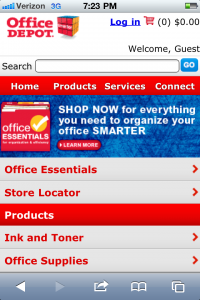
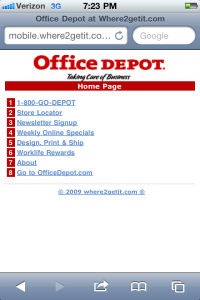
Here’s an example of how Office Depot works their diversions:

This is their organics page:


This is their PPC page:

Granted, neither of these are perfect (especially the PPC one, which is frankly quite abysmal) but they are examples nonetheless.

How many diversions can you have?  As many as you want.

Where should you use them?  Depends on what you can manage.  A lot of folks start out by doing just a couple (for their most popular sources) and then go from there.  You don’t necessarily need a new page for each and every source.  It really depends on your traffic and how you want to manage it.

Have other questions about diversions?  Post them in the comments below or jot me an email at info@amyafrica.com.

P.S.  Doing PPC?  Click here now for a must-read article from Rimm-Kaufman Group about mobile PPC.

Filed Under: Mobile

Mobilize Don’t Miniaturize!

10:53 am by Amy Leave a Comment

Jason F. writes “I recently saw you speak at Conversion Conference.  (I was at eMetrics and crashed your session.)  We’ve got an iPhone app (it’s not getting any traction) and a full-blown mobile site that we spent about a million dollars developing.  (Don’t ask, you won’t approve.) We’re not getting many orders and a lot of our users are bouncing off the first page.  What are we doing wrong? I know you said that people need to mobilize their sites, not miniaturize them.  We made the mistake of miniaturizing which we know we need to fix but it’s a huge process.  What can we do in the meantime?  You got any advice for us?”

Thanks for writing Jason.

Here’s the thing…

A lot of people are doing exactly what you did with mobile.  They are taking their big site with bazillions of products/services and they’re smushing it down into a little site.  That strategy, although convenient, doesn’t work for the user.

The good news is that you can fix it.

One of the best things about this new mobile world is that customers are extraordinarily forgiving, so here’s what you can do.

First, optimize your speed.  Right now, it’s one of the only things that matter.  Mobile users will not wait 15 seconds for your site to download.  Period.  End of story.  Your goal, whether or not you choose to accept it, is a low page weight.  (Under 100K, preferably closer to 10K.)

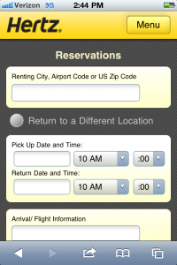
Second, develop a killer entry page.   This will make a huge difference in your success.  Why?  Because the first page that the user sees has a direct indication on their conversion success. 

How do you do this?  Be clear about your goals.  What’s your goal?  Branding?  Acquisition?  Engagement?  Retention?  Customer service?   Sadly, it’s very unlikely that it will work the same as your traditional site – in fact, it’s often polar opposite. 

If your site is an ecommerce site, then make it look like an ecommerce site from the get-go (you know, with things like a perpetual shopping cart.)  If you’re trying to get something else, focus on it.   

Focus on one thing — the lead, the order, the email address – whatever is THE thing that you want.  The most successful companies in the mobile space, live and die by their funnels.  They know what their end-goal is so they can work backwards accordingly.

Jason, you have an existing site that you spent a boatload of money on but even if you hadn’t, the key is to figure out what  you want in the end (orders, inquiries, customer service, etc.) and then develop a plan to get to it.  It sounds very simplistic but that plan starts at the very first page of your mobile site. 

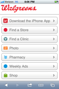
Are people clicking on your store locator?  Are they signing up for a catalog?  Trying to purchase something?  Adding themselves to your email list?  Tracking their packages?   Comparing prices?  Reading the user reviews?  Downloading a white paper?  

Remember, this is somewhat of a self-fulfilling prophecy (when it comes to navigation, you get what I give you) so choose your topics carefully.

Pick the things that are most important to you, showcase them appropriately (you have room for about 5-8 solid choices) and then track the hell out of your results.

I realize that this sounds overly simplistic but developing a killer entry page is one of the very best ways to get a good foundation that you can build on.

Have a question you’d like answered?  Click here now.   It’s FREE!

Filed Under: Mobile, Strategy

  • « Previous Page
  • 1
  • 2
  • 3
  • 4
  • 5
  • 6
  • …
  • 11
  • Next Page »