Amy Africa's QLOG

99% queries & quintessentials. 1% quibblings

  • 
  • 
  • 
  • 
© 2009-2025 Amy Africa's QLOG

Powered by Genesis

Who The Hell Is No Reply & Why Is He Writing Me? E-Mail Worst Practices: Mercedes-Benz

12:21 pm by Amy 4 Comments

There are many things that influence the success of your thrusts and triggers. Most of those things happen “outside the envelope.” (In other words, before the user opens your e-mail.)

One of the most important is the “from” address. Things like format have an impact on deliverability, but users don’t understand things like format. They only know that their images are broken. (Translation: they can’t see them.) What they do understand is to whom the e-mail is addressed, who/where it’s coming from and the subject line.

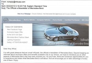
Mercedes makes a lot of errors with their “from” address. First off, it’s noreply@mbusa.com. Seriously, no reply? It’s bad enough that it’s mbusa.com but no reply? What kind of name is that? He must be related to Pig Will and Pig Won’t from Busytown Mysteries.

To add insult to injury, in one of the first lines of their e-mail, they state “Ensure Delivery: Add Mercedes-benz@mbusa.com to your contacts. Yeah, so if you are going to ask me to whitelist you, you might want to use the address you want me to whitelist you for. I mean really. (No, it wasn’t cloaked or redirected.)

Bottom line: “From” addresses are important. You should use a “from” address that your users recognize and would like/expect to hear from.

BONUS TIP: If you are going to test your “from” addresses – you should test ONLY mailing new-to-file names first. Then, you can test the winner against the control.  Otherwise there’s too much bias.  You can account for it, but it’s way more difficult than it appears and seldom worth the drama.
Filed Under: Email Marketing

10 Proven (and Profitable!) E-Commerce Tips for Catalogers

10:44 pm by Amy Leave a Comment

1. Separate your Direct/No Referrer Traffic from everything else.  Most catalogers and offline marketers don’t bother doing it and it’s a huge (as in colossal) mistake.  There is (or should be) a BIG difference in adoption to cart and/or conversion from people who know you and people who don’t. 

2. Fix your Catalog Quick Order form.  It’s obviously broken.  How do I know that?  Well, look at your results. Are you getting 80%+ conversion on it?  If so, you’ve got nothing to worry about.  If not, you’ve got some work to do starting with what you call it.  Catalog Quick Order is for ordering catalogs.  “Ordering from a Catalog?” is for, well, ordering from a catalog.

3. Show a picture of your catalog in at least one (preferably two or three) places on the first view of your site – on your major entry pages for all direct/no referrer traffic.   (This is only applicable for direct/no referrer traffic.  If you can’t separate your traffic yet, only show one representation of your catalog per view, preferably in the righthand corner under your offer box.)

4. Use carousels on your major entry pages.  Carousels are those simply-animated banners in the top middle columns of sites.  They usually have 5-6 rotations (more rotations than six isn’t usually wise.)  The purpose of those banners is to get people to drill deeper into the site so you need to make sure that every rotation has an action directive (click here now, buy now, shop now, and so on.)  Need a good example? Check out www.budk.com (B2C) or www.marcopromotionalproducts.com (B2B).  

5.  Look carefully at your text search.  This is one of the top two places where a lot of catalogers drop the ball.  Unlike pureplays, you need to be able to handle item numbers.  Not just item numbers but more specifically error handling for item numbers.  (15ish percent of the folks are going to screw up the entry —  it’s your responsibility to correct/fix/handle that.)  You also want to look at your word connect.   Online companies have this figured out (mostly because of SEO) but traditional marketers (catalogers and direct mailers) often don’t get this at all.  Having a difficult time figuring out how to best approach your text search?  Start with the words people are using to find you and then compare them to the words they are using on your site.  Also, be sure to look at both successful AND unsuccessful searches.  Just because you present finds doesn’t mean that they were what the user was looking for.

6.  Show at least three items you can buy above the fold.  The exception is your product pages where you are only featuring one item.  Category, department, and entry pages all need a selection.  Consultants can debate whether or not people scroll till the cows come home but whether or not you will actually scroll (you will) doesn’t really matter. 80% of our activity happens on the first view.  Make sure to work it hard. 

7.  Use instigated chat.   Live Chat works.  Instigated chat REALLY works.   Instigated chat means that you start the discussion with the customer as opposed to the customer clicking a button to initiate a chat with you.   Try it on the places that your visitors have the most trouble with – text search results (or no results as the case may be) and checkout.  Then, when you’ve got it mastered there, look at your entry pages and your product pages.  Instigated chats tend to work best here if they are based on time spent on the page so you’ll need to play around a bit before finding YOUR magic formula.

8.  Sell your soul to the devil for your users’ e-mail addresses.  Sure, you can e-append your house file but you’ll often get different (and sometimes better) e-mail addresses if you ask the user for them.  Collect e-mails in every view – especially the first view – till you have them and then all but one of the capture boxes can disappear.  By the way, there are two major e-commerce providers whose “best practices” are to put the e-mail capture on the bottom and only the bottom.  From what I’ve seen, this has to do with their programming, not what actually works for their clients.  E-mail addresses are one of the most valuable things you can have in your database so do what you have to do to get them even if you have to “break template.”

9.  Choose brains and brawn over beauty.  Use a lefthand index and a righthand column.  Yes, it’s ugly but it really is the very best formula.  Using ONLY top navigation puts way too much dependence on the user’s skills, which you’d likely NOT bet your house on.  Your lefthand column should include your e-mail sign-up, text search, highlights of your store, an alphabetical listing of the stuff you sell, your about us and customer service information and possibly a friend-get-a-friend box.  The purpose of the righthand column is to “save” your visitors from exiting.  What works best there?  Plugs (non-animated banners) that get the user to drill deeper into your site.  Check out www.eastwood.com for a good example of a cataloger who knows how to work their plugs.

10.  Refine your abandoned cart program.  One e-mail is not a program so if that’s all you have, you’ should start embellishing it.  Look at developing pops on exit, a series of e-mails and then catfishes or midis to welcome them back.  One of the biggest keys to success for abandoned cart programs is timing so if you haven’t played around with when you send things out do that now.  Each company has its own secrets to success so you have to play around a bit before you find your mojo.

Filed Under: Conversion

All About The Word Connect…

11:55 pm by Amy 4 Comments

Want to increase your sales?

Want to decrease your bounce rate?

Want to escalate your AAUS (average active user session) and adoption to cart/lead?

One of the easiest (and most effective) ways to do all the above — without breaking the bank — is to improve your word connect.

Don’t know what the word connect is?  You’re not alone.  Most people don’t.  It’s one of the things that typical usability consultants don’t talk about because they don’t know enough about how the brain perceives online experiences.   It’s also one of the things that will make the biggest difference in your website effectiveness.

Take someone who is searching for t-shirts.  Whether or not they type in tees or T’s, t-shirts or tshirts, there is no doubt they are looking for t-shirts right?  Right.

What they are not looking for is apparel.

Your apparel category may have have tees, T’s, t-shirts and tshirts, as well as shorts, pants, sweaters, jackets, hoodies and the like but “apparel” as a choice is not any variation of T’s, which means there is no word connect.

The brain is designed for efficiency.  (It needs to save all its energy to protect you should you find yourself in danger.)  It takes a lot of shortcuts.  For example, if I tell you that a bat and a ball cost $1.10 and the bat costs $1.00 more than the ball, how much does the ball cost?

Most people immediately say that the bat costs a buck and the ball costs 10 cents.  That’s intuitive but incorrect.   For the bat to cost $1.00 more than the ball, the bat needs to cost $1.05 and the ball $.05.

When you are looking for t-shirts, your brain will look for all the appropriate variations of t-shirts, but it won’t immediately connect with anything but t-shirts and t-shirt-y words.

Then, less than half (yes, you read that correctly) of the time we will do a second pass over the offered categories to determine where our “word” fits.  Bottom line: you have one chance to make a word connect.  If you don’t get it, you will lose about 55% of your visitors (hello, high bounce rate, low user session and poor conversion.)  

What does this mean for you?  Put simply, it means you need to make sure your most popular words are clearly represented in your navigation.  (Hopefully your top navigation, lefthand navigation AND bottom navigation.)

This applies to whatever you’re selling, advertising, promoting, or showcasing.  (In other words, the word connect is meaningful whether you are a blogger, an ecommerce site or anything in between.)

Don’t know where to start?  First, look at the most popular words people are using to find you at Google, Bing, etc.   Next, look at the words people are using in your text search on your site.  (If you don’t have a text search, that’s fine, just look at the keywords folks are using to get to your site.)  Look at the top ten matches and make sure your words are there.  If they’re not, try adding them.

Have a bazillion items and don’t know how you can do this effectively?  Follow the two steps above but look at changing your category/department pages first (instead of your home page.)  It’s a baby step in the right direction.

You can SEO your site till the cows come home, but if the user doesn’t connect the word they want with the words on your site, it’s not going to make a damn bit of difference.  It’s all about the connection, Baby.

Filed Under: Conversion

You Don’t Know What You Don’t Know…

11:56 pm by Amy 6 Comments

Imagine you are an old Iranian man living in a tiny, dilapidated, one room shanty, smaller than the size of an American closet.
 
You are very, very poor and live on little — perhaps a couple of vegetables from your meager, one-row garden and a twice-a-year splurge of canned beans.
 
Your rich uncle comes to town.  He has oodles and oodles of money.  Fancy clothes.  Fancy cars.  Fancy houses. 
 
He spends more on a meal than you spend on food for a year.
 
For dinner, you serve him all the vegetables from your paltry garden and a can of beans — your entire allotment of food for the next ten days and the beans you were saving for your birthday.
 
In Farsi, this gesture  is called tarouf.  In English, we don’t have a word for it.
 
Sure, it could loosely be translated as an “offering” but that’s not really what it’s about.
 
You could also say “chicken on Sunday, feathers for a week” but that’s not really what it is either.
 
Both of those things work around the word, but they don’t define the word itself.  The word tarouf remains lost in translation. 
 
It’s sort of like when you go to the doctor.  The doctor tells you that your labs are fine and your blood pressure is good.  Thus, nothing should be wrong with you.  You know in your gut that there’s something terribly out of sorts but you listen to the doctor as he knows best.  After all, he went to Harvard Medical School and did two back-to-back fellowships at the Mayo.
 
Of course, there is a good chance that there is indeed something wrong with you — the doctor just doesn’t see it because he only sees you through his doctor-colored glasses — through what he has learned and what he knows to be true. He doesn’t have a word for what’s wrong with you so to speak. 
 
As marketers, we spend a lot of our time putting things into buckets — separating this from that.  We rationalize that we are doing the right thing because we are “looking at the numbers” and the numbers never lie.  However, we also assign things that aren’t always the case….
 
There’s not a week that passes by that I don’t hear “We only send emails twice a week because that’s all our customers want” or “we don’t use pop-ups because everyone blocks them” or “we don’t need to tell people our guarantee because they all know it.”
 
Yeah?  On what planet?
 
I mean really.
 
Just because you personally don’t want more e-mails or you don’t like pop-ups or your guarantee is tattooed on your forehead doesn’t mean that your users feel/are the same.
 
As my dear friend, Grace Cohen, says:  “You don’t know what you don’t know.” 
 
There are words out there, like tarouf, that are not yet in your language and there are things out there that your users do that you haven’t yet assigned a bucket.  Just because you haven’t recognized them doesn’t mean they don’t exist.
The companies who do best online (in terms of profitability, not necessarily in number of Twitter users or Facebook fans) are the ones constantly looking for new words and new definitions.
 
They put aside their own preconceived notions about what works and what doesn’t.  They test new things.  They backtest old things.  They don’t automatically say “we haven’t tried it but it won’t work.” 
 
They take off their glasses — and put away all their biases — in a quest for meaningful learning.  In search of, well, tarouf.

Filed Under: Strategy

Don’t Move. Just Clean Your Damn House!

11:57 pm by Amy 14 Comments

It drives me crazy when Forrest Gump says that “life is like a box of chocolates, because you never know what you’re going to get.” What in life is as knowable and safe as a box of chocolates? You might not know if the filling will be caramel or a goopy cherry, but you know you’re getting BITE-SIZED CHOCOLATES IN ASSORTED FLAVORS, and you can look at each one for many more clues. 

When your brain (yes, I am talking to YOU) processes any new piece of information, it asks itself a series of questions…

Can I eat it?

Can it eat me?

Can I mate with it?

Can it mate with me?

Have I seen it?

Have I never seen it?

That’s right….  Have I seen it?  Have I never seen it?

This is critical to your website.

In my speeches (you know, the ones I used to do before I got tired of hearing myself talk), I spend a lot of time discussing grocery stores.  When you go to Piggly-Wiggly in South Carolina, Hannafords in Maine, Safeway in Seattle, or Kroger in Texas, you know that the milk is going to be near the eggs.  You know that the bananas are going to be near the apples.  And you know that the ice cream will not be on the shelf in the dog food aisle.

You know this because supermarkets are FAMILIAR.  Sure, there are differences in the end-caps and signage, but for the most part, grocery stores are all the same.  You’ve seen one, you’ve seen ’em all, right?

Why is this important?  It’s critical because when your brain recognizes something as familiar, it knows whether or not it’s safe.  If you don’t need to evaluate whether or not something poses a danger to you (meaning your brain can skip that entire step), you can start to interact faster. 

On the web, faster interactions typically equal greater conversion, more adoption to cart/lead form and thus, more sales/profits.

Companies send us RFP’s all the time for complete redesigns.  They’re bored with their websites (or some new VP comes in and wants to mark his territory) and thus automatically think their customers are too.  Not only is that NEVER the case but it’s also VERY dangerous to start demolishing everything familiar. 

You need to make changes?  Refresh.  Don’t completely redesign.  That way when the user asks himself “Have I seen it?” he’ll be able to say “yes” and move right along to the important things.  You know, the ones that make you money.

Amazon is the perfect example of a company that constantly makes little, but VERY significant, changes.  Over the years, they’ve added all sorts of bells and whistles to their site.  Do you notice at first glance though?  Not likely.  Why?  Because the look and feel is virtually the same as it was the last time you were there.  Same colors. Same layout.  Same search in the same place.  Amazon’s website has changed (for example, the recent addition of the flash cart) but it’s still comfortable… and familiar. 

So next time you’re tempted to overhaul your entire website, just rearrange a couple of the chocolates in the box instead. Or as the Southerners say, “Don’t move just because you need to clean house.”

Filed Under: Strategy

4 Sure-Fire Ways To Spot The Idiots On Your Web Site

11:10 pm by Amy 15 Comments

Yesterday, as I was barreling through the drugstore, a woman blocked me in the vitamins/supplements aisle.
 
“How many of these do I need to take a day?” she yapped.  “I didn’t bring my glasses and the print is too small.”
 
I looked at the bottle.
 
The print may indeed have been too small on the back of the bottle but it was clear as day on the front and it said…  Wait for it… 
 
“ONE A DAY.”
 
“Seven.” I replied as I ducked underneath her T-spread arms and whipped past her.
 
“Seven?  Really?  That’s not a very good value.  I guess the metabolism boost costs extra.”  She lamented with a great big sigh.  (And no, I have no idea how the metabolism boost related and I wasn’t about to ask.)
 
I turned my head to watch her hesitantly put the bottle back on the shelf.
 
For a minute, I thought about leaving her there stranded but then I felt bad.  It wasn’t her fault that her parents hadn’t been forcibly sterilized.
 
“I was joking.” I said half-heartedly.  “The vitamins are called One A Day and their selling point is that you only need to take one small vitamin a day.”
 
“Oh, that’s fantastic!  Just what I wanted to hear!  They are Buy One Get One FREE right now, you know?” She yammered enthusiastically as she happily placed two bottles in her little red basket.  “Thanks for your help.  Next time I promise I will remember my glasses!” 
 
In real life, there are a lot of people who go into the dollar store and ask what the price is of every item.  Sadly, in the online world, there seem to be even more wackadoodles.
 
Here are four things you can do to find them (the 3 French Fries short of a Happy Meal folks, that is) — so you can help them.
 
1. Look at your exit pages.  I’ve talked ad nauseam about exit pages — in fact, they seem to be one of the few things I am interested in blogging about.  Reason being: they are one of the things that you must look at and most people don’t because they’re not very sexy.  Your exit pages list tells you where the majority of people are leaving.  It’s your best weapon for dusting the seats of the Titanic.
 
2. After you’ve identified your exit pages, look at the most popular ones.  Then check out how much time the user is spending on them before they exit.  If the user is spending more than 30 seconds on an average page, they may need help.  (Instigated chat works wonders here.) 
 
3. Look at your bounce rate.  Many consultants dismiss bounce rate as not valuable because they don’t know how to correct it.  (You won’t get money for things you don’t know how to fix.)  There are two primary reasons why people leave immediately from your site — (1) they shouldn’t have been there in the first place (bad traffic) or (2) there’s a disconnect that happens in the user’s brain wherein they literally do not know what to do next.  (I’ll talk more about that in an upcoming post.)  Have a high bounce rate?  Consider using catfishes or sidewinders on entrance.  Look at pop-unders and midis on exit.  If you get a lot of direct/no referrer traffic, look at directing them to a different page.  (This is one of the best tips you’ll ever get.)  
 
4. Look at what words people are using in your text search.  If your navigation sucks, there will be a lot of dependence on text search.  (There’s more on this here.)
 
Users often need a little help.  As your site’s zookeeper, it’s your job to provide it.
 
Sign-up today for our Thinking Inside the Box newsletter.  It’s FREE and you can unsubscribe any time.  Did I mention it was FREE?

Filed Under: Analytics

The #1 Thing Offline Marketers Need To Know When They’re Marketing Online…

11:50 pm by Amy 6 Comments

Trisha Lynde says “I attended one of your webinars last week. At the end, someone asked what you thought was THE most important thing for traditional direct marketers to do (we’re a privately held business that sells primarily through the mail — catalogs, flyers, postcards, and the like.)  Before you could answer, I got disconnected and was unable to reconnect.  WHAT WAS THE ANSWER?  I AM DYING TO KNOW.”

One of the biggest mistakes that traditional direct marketers make — especially catalogers — is that they don’t separate direct/no referrer traffic from everything else.

If you mail; have sales reps; do outbound telemarketing; advertise on the radio/TV; or do anything else offline, YOU’VE GOT TO SEGREGATE YOUR TRAFFIC.   (This traffic separation thing applies to pure-plays as well but that’s a completely different discussion.)

For the most part, online and offline users behave differently.  (Oftentimes, they behave VERY differently.) 

Most web analytics folks don’t talk about it because frankly, they just don’t know anything about it.

Offline users who visit your website tend to have very different AAUS (active average user sessions); user paths; and/or drills and page visits.  The time spent per page often varies dramatically.  (Depending on how your site is set up.)

In many cases, offline users tend to come in, look around and then get out.   In others, they tend to spend an inordinate amount of time on your site – basically struggling to find something that they know should be there.   So, unless you get them to the right place rather quickly, their page views tend to be higher OR lower than average.  Same with AAUS.

Bottom line: If you are sending offline users online, you need to look at where they come in and where they leave.  You also want to look at how many pages they look at AND most important, you need to get a good idea of what they are looking for while they are there.

If you are a cataloger, look closely to see if they end up on your catalog ordering page.  A lot of times, offline users can’t find these pages because they think that CATALOG QUICK ORDER is the place where you’d order a catalog.  Not order FROM a catalog, but order a catalog itself.  (That’s why “ORDERING FROM A CATALOG?” typically works better.)

The most critical thing you can do with an offline user who comes online is to collect their e-mail address.  It’s important that you try to capture their e-mail on EVERY view of the site, not just on the bottom.  (Once you get the address, all but one of the capture boxes should disappear.)

You also want to make sure that you put the phone number all over the place, especially in the header (at the top), footer (at the bottom) and in the righthand column.  The phone number and contact information should be prominent throughout the ordering/checkout process.   This is far more important for offline users than one might think. 

You can also consider a catfish.  (Look at www.twitterwatchdog.com for a good example of a catfish.)  A catfish pops up on the bottom of the first view of your site on entrance.  Catfishes are one of the most successful (and least used) capturing tools.  You can use your catfish to welcome the user from an offline channel (if you have an idea of what it is); collect his e-mail address; or bring him directly to your quick order page.

The more you know about how the different types of users behave, the better.  Generally speaking, targeted offline users will convert better than online users, if your site is tailored for them.  (Employing a streamlined checkout, for example.)   This is especially true if the user is using your website as their preferred ordering channel (read: instead of the telephone.)


For the record, direct/no referrer is not a completely pure indication of whether the traffic is coming from an offline source.  Someone can come in direct/no referrer having remembered your URL from an e-mail, a friend, a past visit, etc.  However, it is a solid indication and with web stuff, you are NEVER going to get 100%.  No matter how much time and money you throw at it, perfection is not a possibility.  So, go with the trends and indicators.

Filed Under: Analytics

Conversion: It’s a Piece of the Picture, Not the Whole Puzzle

9:05 pm by Amy 2 Comments

So, the other day while I was sitting outside waiting for a friend, I observed a rather suspicious man pacing up and down the sidewalk.  

The guy was in his late 20’s-early 30’s and I could tell from his body language that he was definitely up to something.  I knew he wasn’t going to rob the bank (which coincidentally we were both near) so I tried to figure out EXACTLY what he was going to do.   (Yes, this is indeed the type of thing I do when I am avoiding e-mails and BBM.)

I watched him stare at the hippy-chick with the dandelions in her hair who was screaming at someone in Tagalog on her phone.  (The romantic in me was actually hoping he was going to propose to her.)

I saw him glance furtively at the three scantily-clad college girls whose combined outfits used less fabric than a scarf.

I looked at him chin-nod at the surfer dude; purse his lips at the skateboarder with the pants that STARTED at his knees; and grin at the bimbelina who was stuffed so full of Botox she couldn’t smile back.

I was so focused on him – the suspicious guy — that I completely missed what was really happening…

A flash mob.

As I watched the “suspicious guy” I came up with all sorts of notions of what he was doing. 

Sadly, none of my ideas were right because I wasn’t looking at the whole picture.

Very similar to the twisted way in which a lot of folks look at web conversion these days.

Don’t get me wrong, I am a big conversion proponent.  I write about it, I give speeches about it and I pimp out our kick-ass conversion services on a daily basis.

However, conversion is NOT the end-all be-all.  I repeat.  Conversion is not the end-all-be-all.

It’s like this morning. One of our newer clients called me yapping about how their conversion was tanking.  He went on and on for a little over twelve minutes before I could get a word in sledge-wise.   When I finally got to ask “so, how much are sales down?” I was met with a deafening silence. 

“Sales are up almost 30%.” The voice on the other end replied.

It was all I could do not to slam the phone down.  “So, your traffic is up.  Your e-mail subscriptions are up.  Your sales are up AND your profits are up.  What exactly are you bitching about?”  I asked.    (Yes, this is why I’m not really allowed to deal with clients these days.)

Before he had a chance to say a word, I continued.  “This is the thing about conversion.  Anyone can improve your conversion.  If I wanted to just improve your conversion, we would have blocked all the garbage traffic from your site. Your conversion as a percentage would have skyrocketed but what exactly would that have done for you?  Yeah.  Notsomuch.  It would have done jack.”

Conversion isn’t a flash mob. 

You can learn from it but you’ve got to look at the big picture.  Look at it as a percentage trend alongside your sales and profit numbers; the number of new customers you’ve brought in; the number of customers you’ve reactivated; your traffic numbers; and so on.  If you do that, you’ll get a much better idea of what’s going on…

P.S.   If you’ve never seen a Flash Mob before, click here now for a good example…

Filed Under: Conversion

Seriously Nordstrom, Quit the Crack. Usable Sites Are the New Black.

12:10 pm by Amy 1 Comment

I tried to place an order from Nordstrom the other day.  (I won’t even begin to bore you with the details of how they DUMPED MY FLIPPING CART AFTER LEAVING THE SITE FOR EXACTLY SIX MINUTES.)
 
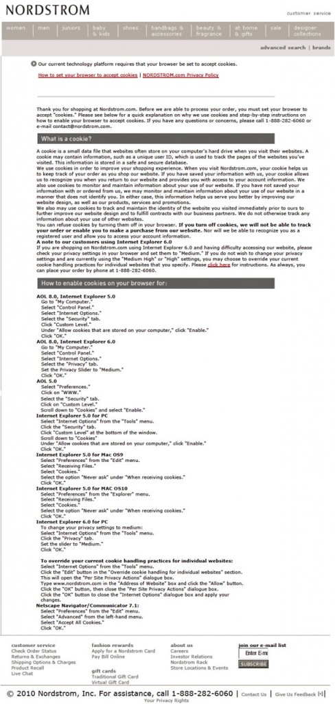
This is what I got when I attempted to check out. (God only knows who wrote this copy. I thought Solzhenitsyn was dead.)


This is the type of thing customers HATE. 
 
Actually, that’s a lie. 
 
They don’t even get a chance to hate it as they leave IMMEDIATELY after seeing it.  (Or get lost trying to solve the problem, which is even more exasperating.)
 
Every site has this kind of stuff.  Your mission, whether or not you choose to accept it, is to find it on your site and fix it. 
 
Begin by looking at your exit pages.
 
Now.
Today.
 
As in right this very minute.
By the way, two minutes after I posted this, Jason Billingsley (@jbillingsley on Twitter) commented that what he got from the post is that I browse with my cookies off.  Yeah, well, I adore Jason (he is truly one of my favorite people in this industry) but he’s also a smart ass.  No, I don’t browse with my cookies off.  They’re always on.  This was an internal conflict with IE, which didn’t happen on Firefox.  Companies know this stuff by looking at their exit pages.  Period.  End of story.

Filed Under: Strategy

10 Proven Tips for Making Your Trigger E-Mail Program a Success!

10:58 am by Amy 2 Comments

These days, everyone and their brother has a thrust e-mail program but surprisingly, very few folks have triggers.

Trigger e-mails, also known as good dog e-mails, are sent to individuals based on actions.  The action could be good (thanking them for an order), bad (when they abandoned a cart, for example) or indifferent (confirming a vote in a poll) but it’s always a happening/event/instance.  Triggers are successful because they have higher response rates, better deliverability and improved LTP (lifetime profit.)

So, how do you make a trigger program work for your business?   Here are ten proven tips…

  1. First things first.  Like most e-mails, the majority of your success will come from outside the envelope – in other words, make sure to spend some time perfecting your “from” address (works best if it comes from a “real” person);  “to” address; subject line (you have 24-35 characters because that’s what fits in most inboxes); the first two lines of the e-mail (statistically over half the people stop reading after the first two lines); the format and the deliverability.
  2. Inside the envelope, work the top two inches of your e-mail.  A lot of companies really blow the “preview pane” of the e-mail – they stuff in a bunch of irrelevant copy (for example, an unsubscribe message, which should NEVER go at the top) or even worse,  they’ll leave the first two inches blank, just a meaningless blob of white space.  The best e-mailers know that “you need to work your window” – meaning make sure that whatever you want the reader to know is right up top.  For example, if you have an offer and/or a deadline, it needs to be in that space.  If you’re featuring new products, make sure you have an “xx new items” headline at the top. 
  3. Implement your trigger program in stages.  Lots of folks wait till they can do all the triggers, which isn’t the best strategy as some are so much more difficult than others.  Figure out which ones you can do easily and start with those.  Some ideas would be abandoned cart, abandoned search, abandoned site, EBOPP (e-mail based on past purchase), EBOSI (e-mail based on selected interest), we’ve missed you, a celebration (happy birthday, congratulations on the new baby), ask the experts (tips, case studies, podcasts, webinars), surveys, and automatic reactivation promotional programs.
  4. Start simple.  Is the list of e-mails above overwhelming?  Then start by improving your order and shipping confirmations and/or your thank you e-mails.  Make sure you have nice thank you e-mails for everything that the user does on your site – signing up for your FREE newsletter, requesting a catalog, registering at your site, filling out a request for quote, and so on.  Look carefully at each of those e-mails and figure out what you can do to improve it – what it would take to make someone want to click on it and do/buy/view more?  Does every e-mail you send out look like it’s from a real person?  Is it written like a letter you’d read?  Does it have things of interest that they haven’t seen before?  Will it make them want to click?
  5. The magic formula for triggers is all about the timing.  Reward them for what they do right (and wrong), at the perfect times.  Always and often!  For example, using one abandoned cart e-mail is ok but using a series of five (or more) is fantastic and really makes a program.  You need to keep in contact with them till they take another action – finish their checkout, add to their order, complete their lead form, request a quote, register for a webinar and so on.   The more you ask for what you want, the greater the chance you have of getting it.   In about 95% of the cases, the first trigger in a series should be sent out within two hours of the action.  So, in a perfect world, if a user goes to your site, puts stuff in their cart and then abandons it, they will get their first abandoned cart e-mail within a couple hours (the sooner the better as long as it’s not in the repeat window.)  If you can’t deploy those e-mails one-by-one and you simply must do a batch process, do it.  It’s not the best choice, but it’s far better than nothing.
  6. Use an offer with a deadline.  Deadlines work because they create urgency and cause people to focus.  Can’t give anything away?  That’s ok but figure out how to incorporate a deadline anyway – there are lots of choices — limited quantity/limited supply, a limited-time sneak peek, etc.
  7. Personalize as much as you can.  If someone abandons a cart on your site, show them what was in their cart in the e-mail.  Make it easy for them to complete their order.  Never press though – pressing is knowing too much about someone (for example,  “you were at our site at 12:03 this afternoon and you were looking at…” – that’s just too much and users typically don’t respond well to it.)
  8. Don’t spend a ton of time nitpicking the creative.  The best trigger campaigns are not always the ones that are the most aesthetically pleasing.  In fact, they’re usually the ones from the companies who have the timing and the message down right.  Mailing the right offer (message) at the right time is far more important than having everything just perfect.  (Remember, e-mails are meant to be clicked on, not necessarily to be read or printed out and hung on your wall!)  That’s not to say that the visuals are not important because they are critical – people see things in pictures online – however, it is to suggest that you don’t need to make your designer go through 111 versions of a trigger to get it just right. 
  9. Don’t forget the buttons.   Triggers, just like thrusts, need very solid action directives – big, red, CLICK HERE NOW buttons that get them to click to your site, cart, lead form, or wherever else you want to put them.  Make sure to include at least one button in every view. 
  10. The person with the most e-mail addresses wins.  You can’t send a trigger e-mail out to someone if you don’t have their e-mail address.  So, if you’re going to commit to a trigger campaign/program, you need to collect e-mails anywhere and everywhere you can on your site.  Make sure your e-mail captures are on every view of your site – not just along the bottom.  Try using pop-ups on exit, especially for abandoned carts and searches.  (Don’t think pop-ups work?  Try them.  You’ll be pleasantly surprised.)
  11. BONUS TIP:  Track.  Track.  Track.  It doesn’t matter what you do if you’re not measuring it properly.  When it comes to triggers, look at open and delete rates; clickthrough rates; page views/user paths; AAUS (active average user session) and time spent on launch; drills/actions; passalong rate, action rate (carts opened, lead forms completed) and item sales (be sure to include feature items and items that were not in the e-mail.)   Build on your success.  If something works, keep doing it and keep improving it.

Filed Under: Email Marketing

  • « Previous Page
  • 1
  • …
  • 5
  • 6
  • 7
  • 8
  • 9
  • …
  • 11
  • Next Page »