 This is part 2 of a 5-part series. Part 1 can be found here. Part 3 can be found here. Part 4 can be found here. Part 5 can be found here.
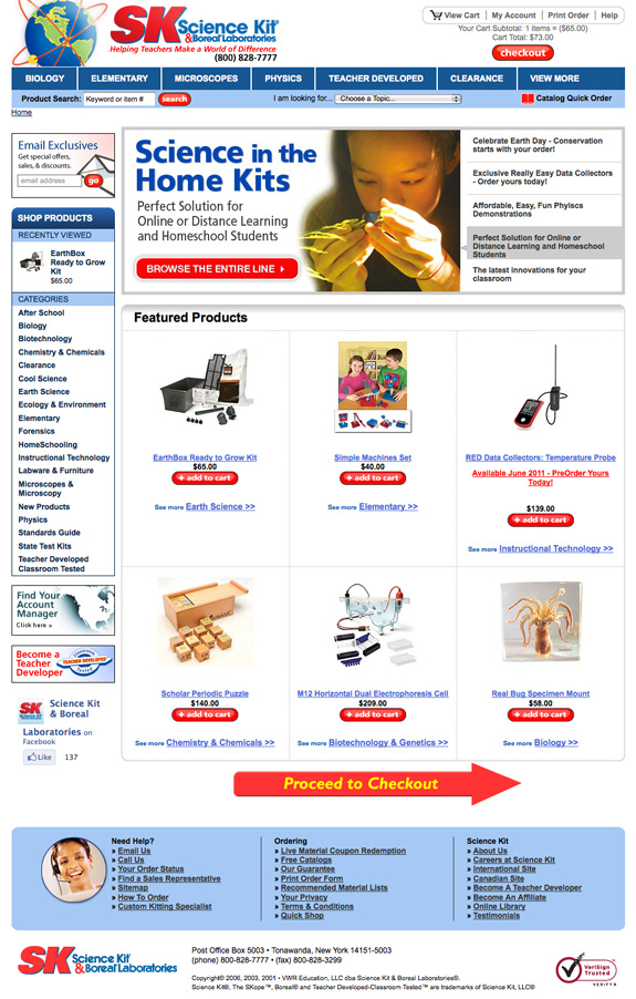
6. Develop the Perfect Multi-Step Checkout. I know. I know. One-page checkouts are all the rage. Why on earth would I recommend a multi-step? Lots of reasons. One-page checkouts don’t work for everyone. I mean, if someone wants your product badly enough, they’ll force themselves through any kind of checkout (hello Yahoo stores) but the reality is that you should cater your checkout to your users on an individual basis – sometimes that’s a one-page checkout and sometimes it’s a multi-step checkout. Plus, one-page checkouts don’t always give you an accurate indication of what’s not working in your checkout.
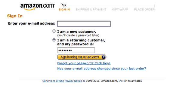
What’s a good multi-step checkout? The most successful multi-step checkouts are usually five pages: Welcome, Bill To, Ship To, Payment, Confirmation. You can test other variations but if you don’t have a good place to start, start with the one above.
7. The Welcome Page is the most important, ESPECIALLY if you don’t have the user’s email address. The purpose of a welcome page? To collect the user’s e-mail address so if they abandon at any point from then on, you can send them abandoned cart trigger emails. Need another reason to keep your Welcome Page simple and to the point? Research has repeatedly proven that the faster the user thinks your checkout process is, the likelier he is to finish it. If you master your multi-step and one-page checkouts, then you can work on your one-click-type checkout. Single-step checkouts are great for items that are ordered consistently (consumables like ink cartridges, for example.) Why doesn’t everyone have a single-step checkout? Most of the reasons center around security, especially payments. Single-step checkouts are NOT recommended for people who don’t excel security-wise.
8. Ask No Irrelevant Questions. Folks abandon carts and checkouts for a lot of reasons. One of the biggest roadblocks to getting through a checkout? A lot of trivial/unimportant questions. Remember, relevancy is in the mind of the user. So even though you may think a drop-down with 25 choices of
“where did you hear about us?” or “how many employees does your company have” is effective, chances are it’s not when it comes to the user. Recommendation: save anything that doesn’t specifically pertain to the order till after they’ve hit the “complete my order” button. You can ask the user whatever you want afterwards – in pop-surveys, follow-up emails, on the confirmation page, etc. (If you must ask irrelevant questions in the checkout, don’t make them mandatory so if the user chooses not to answer them, they can still complete their order.)
9. Use pop-ups on exit. Yeah, yeah, I know. Everyone hates pop-ups. I’ve heard it all before. Do yourself a favor and try them anyway. I mean really, the people are LEAVING your site anyway. What do you have to lose? Pop-ups are very dependent on creative so test 3-4 versions to determine which one(s) work best for you. (More on pop-ups can be found here.)
10. Use catfishes, midis, windowshades on repeat. VERY few people do this and it always blows me away. Someone abandons your cart, comes back two days later and what do they get? Dirt squat. Try welcoming your users back with a pop or bar that reminds your user that they have something in their cart and gives them an easy way to get right back to it.


