You Don’t Scream at a Rose To Force it to Bloom….
Valerie Vince-Vaughn writes: “My boss heard you speak and now he is your biggest fan. Personally I think you are way too against social media to be respected. Do you think it’s your age? Your bio says you’ve been doing this for a long time. Maybe you’re just out of touch?”
Dear Valerie –
Out of touch? I’d say that hyphenating a name like Vince-Vaughn may be a case of pots and kettles, but there’s a benefit to being ancient, one of which is you better learn to ignore the idiots.
There’s no doubt that I am a social media skeptic.
Yes, I endorse things like marketing with videos, using ratings and reviews, and even advertising on Facebook but from a social media purist (cough) perspective, I imagine I’d be perceived as against it.
Why? I am a realist.
I know that not all forms of social media are created equal.
Nor is social media right for everyone. For example, if your site completely sucks and you couldn’t convert your own mother, driving a bunch of traffic isn’t necessarily going to make you an overnight success.
For the past couple years, social media “experts” (most are about as skillful as a surgeon with tremors) have been telling us that social media is the second coming. According to many of them, it’s right for everyone, every time, everywhere and if you don’t jump on the latest and greatest sharing site immediately (hello Quora), you’ll be sucked up by the blackhole of death in exactly 2.2 seconds.
Here’s the thing…. There are pieces and parts of social media that will work for you but they will NOT all work for you, no matter how much money you put into them.
Take one of my closest friends for example. He is a mucky-muck VP at a $500+ million company. Last year, he spent over $500K on social media with three different outside consultants before he hired one that told him exactly what I’ve been telling him (for free) all along. Their audience wasn’t using Twitter or Facebook. Sure they had over 5,000 fans and followers between those two properties, but very few of them were active. (When they really dug deep into their stats, they found that only 17% of their Twitter followers tweeted more than once every two weeks.)
You can’t scream at a rose to force it to bloom. Well, you can, but you’ll waste a whole lot of time screaming and it’s an exercise in futility.
A rose blooms when it’s ready.
If you want to use social media efficiently, figure out where your customers are. Don’t determine where you want them to be – find out where they are now. Talk to them there – on their turf.
If they’re not actively using Facebook, no matter how much you try to promote Facebook through your e-mails and sharing tags on your site, it’s not going to make a whisker of difference. Yes, you may increase your like/follower numbers but last I knew, those weren’t accepted at financial institutions.
On the flip side, you can decide that you don’t care about your users at all and just develop your social media program for the SEO benefits. (And yes, I am a VERY big fan of this particular strategy.) Michael Gray (@graywolf on Twitter) recently had an interesting blog post about this and just today, Jennifer Sable Lopez (@jennita on Twitter) wrote the Social Media Marketer’s SEO Checklist on the SEOmoz blog. Both are worth reading.
So Valerie Vince-Vaughn, am I dated? Perhaps. But so is money.
The Silent, Yet Deadly EBOSI
When folks talk about their trigger e-mail programs, they’re often talking about the usual suspects: abandoned cart e-mails, thank you for your catalog requests, order confirmations and the like. Most companies don’t send out the EBOSI, which is a shame because it’s often one of the best performing trigger e-mails you can have in your arsenal.
An EBOSI – E-Mail Based on Selected Interest – alerts the users to things they might be interested in based on their browsing patterns.
For example, here’s an e-mail I received from Amazon after looking for robots for the terrorists. (Speaking of which, EBOSI’s work really well for non-ecommerce sites too. The example below is from Amazon, THE e-commerce site of all e-commerce sites but don’t let it stop you from using an EBOSI if you don’t have a shopping cart-enabled site, ok? Ok… )
From: vfe-campaign-response@amazon.com
Sent: 12/25/2010 5:02:09 A.M. Eastern Standard Time
Subj: Amazon.com: WowWee Robosapien Humanoid Toy Robot with Remote Control
Are you looking for something in our Electronics for Kids department? If so, you might be interested in these items.
* WowWee Robosapien Humanoid Toy Robot with Remote Control
* Mini Robosapien
* WowWee Tribot Talking Companion
* Wow Wee Mr. Personality Multi Personality Robot
* Mini Robosapien Electronic Robot
. . .
* WowWee Robosapien Humanoid Toy Robot with Remote Control
by WowWee
http://www.amazon.com/dp/B000161RFA/ref=pe_vfe_x1
. . .
by Wow Wee
http://www.amazon.com/dp/B00068XRS8/ref=pe_vfe_x2
by WowWee
http://www.amazon.com/dp/B0016CC284/ref=pe_vfe_x3
Price: $87.49
You Save: $12.50 (13%)
* Wow Wee Mr. Personality Multi Personality Robot
by WowWee
http://www.amazon.com/dp/B001ALOYR8/ref=pe_vfe_x4
List Price: $299.99
Price: $127.38
You Save: $172.61 (58%)
. . .
* Mini Robosapien Electronic Robot
by wow wee
http://www.amazon.com/dp/B002ZI0EUQ/ref=pe_vfe_x5
Price: $32.49
. . .
See even more similar items:
http://www.amazon.com/sim/B000161RFA/2/
If you already own or have experience with the items shown above, please let us know by using the link provided near the item. For problems unrelated to this e-mail, please contact customer service.
Thanks,
Amazon.com
The main key to sending out an EBOSI is timing. You’ve got to test it to find out what works for you – it’s different for every company. (A lot of it has to do with what industry you are in – for example, software companies tend to have the most successful EBOSI’s when they send out the e-mails within a couple hours.)
Other things to know about EBOSIs:
- You don’t necessarily need lots of pictures and graphics in your EBOSI e-mails. It’s worth testing but a lot of companies make their programs work with purely text e-mails.
- Don’t put too many items in the e-mail and don’t put too few either. 4-6 featured items is a good number for EBOSI’s. If you don’t have four items, add a little copy to the descriptions, so they’re a bit more robust.
- Keep the e-mails short and sweet. Personally, I hate when consultants tell you how long your e-mails should be because in the end, nobody knows what works best for you till it is tested. With that said, for an EBOSI to work best, the user needs to click very quickly back into the site. Not to mention, the best performing trigger e-mails typically look like they were written from me to you (one-to-one).
- As always, the subject line is critical. Definitely reference the product the user was looking for — and yes, in this case, it’s more important than the deal but if you can list both (the deal and the offer), that’s great too.
- Amazon uses a terrible “from” address – it’s meaningless. (It’s so long that “Amazon” doesn’t show up in the box.) Use a “from” adddress that your users will immediately recognize.
- It’s not included above (I cut it to save space) but you need unsubscribe and copyright messaging at the bottom.
- EBOSIs work for non-ecommerce sites too. In fact, a lot of times their statistics are better because the navigation tends to be weaker so the user needs more direction.
Do you have any more tips for EBOSIs? If so, please add them to the comments!
You Can’t Trip Over Your Shoelaces if You’re Not Wearing Any Shoes
Kelly K. asks “I’m the Marketing Director of a large B2B company with over 20 websites. We mostly sell to Fortune 500 companies and the government. As you said in one of your recent posts, all of our sites get plenty of very qualified traffic but we don’t get much action. What are we doing wrong? Do you have any tips for us? Please don’t reference my sites. This is a new job for me and I was hired specifically to fix this problem. Thanks.”
Hi Kelly –
You’re not alone.
A lot of business-to-business companies struggle with this very same problem.
There are two primary reasons that you may not be getting enough “action.” (I am going to assume that “action” means prospective clients signing up for your webinars, whitepapers and the like.)
First, you don’t ask for what you want. If you want people to sign up for your FREE newsletter, you need to ask them. Most important, you need to ask them all over the place till you get it.
What does “all over the place” mean? It means at least 2-3 times on every view of your site.
Isn’t that excessive? Not at all. If you look at your site as each view (what the user calls a page) being one screen, it’s really not that much, especially if you have good creative (copy/art direction.)
It’s important that your action directives are big, bold and IN-YOUR-FACE. (You can find more about action directives here.)
Remember, you don’t get what you don’t ask for so it’s better to be VERY aggressive upfront. Give it your best shot. Once you’ve gotten the lead in whatever form you prefer (for example, sign up for a FREE podcast), you can often eliminate most of the lead boxes.
The second reason that most B2B companies lose/don’t get enough leads is that they screw up their lead forms. (Thus the “you can’t trip over your shoelaces if you’re not wearing any shoes” headline for this post.)
You can’t ask too many questions on a lead form (well, you can, but it kills your chances of getting the lead.) You’ve got to ask ONLY the relevant questions. Relevancy is determined in the user’s mind. Research has shown that every question that you ask that’s not relevant MORE THAN QUADRUPLES your chance of losing the lead.
I understand that a lot of companies want to know things like “employee size” and “purchasing authority.” Personally, I think that information is easier to get from an outside profiler, but if you must ask for it do it AFTER you’ve gotten the barebones of the lead. (Usually name, phone number, and e-mail address suffices.) You can do this two ways: (1) one after you’ve gotten the lead or (2) in a triggered e-mail thank you letter with survey questions.
(Click here now for some additional B2B lead generation tips.)
Mobile app versus mobile site? What’s right for me?
Andrea Leo writes: “I am hoping you can settle this for us. We’ve had FIVE (five too many, I might add!) mobile consultants here in the past three months and they all have different opinions on what we should do – develop our own app or build a mobile site. We put a lot of money in our mobile budget this year and I am afraid we’ll never be able to spend it as we just can’t get anyone to agree what is the right course of action for us. What do you think? What questions should we be asking? I think we’re going to need to bag the ‘experts’ and figure it out on our own.”
Andrea. Andrea. Andrea. You don’t have to be a math genius to know that five consultants equates to at least 17 different responses.
Here’s the thing… Like most everything else, everyone has their own opinions on this. Unfortunately, most of those are based on what the consultant is selling (or making a commission from, as the case may be.)
If you are looking at a 2011 foray into mobile (which everyone should be), you essentially have four choices:
- Enhance your regular site
- Build out an optimized site
- Develop a mobile native application
- Do one or more of the above
How do you pick the one that’s best for you?
First, look at what your users are currently doing (you can get this from your stats.) Then, ask them. (Surveys about mobile experiences are often very effective, especially if you can use Facebook/Twitter as a driver.)
I’m one of those people who doesn’t count the iPad as a mobile device. I know a lot of folks do. I just don’t think it’s appropriate based on the conversion levels I am seeing. (Currently, iPad experiences are performing better, as a percentage, than regular sites pretty much across the board for non-Flash sites.)
Look at what devices your user is using. There is a big difference between a Droid, a BlackBerry and an iPhone. You need to know what your customers favor – this is critical and a lot of folks underestimate it. (I recently saw a B2B company spend a boatload on an iPhone app only to find out a couple of months later that 75% of their biggest customers have BlackBerries.)
Look at what networks your users are on. AT&T on an iPhone isn’t at all like browsing on a Bold using T-Mobile.
Find out what your users are doing on their phones. Are they spontaneously going to your site or are your e-mails and text message programs driving them? There’s a big difference between a user who’s being driven by your marketing versus someone who ends up at your site all on their own. This is especially applicable if you’re getting a lot of traffic from social media. For example, if your average user is coming from your Facebook account, the last thing they’re going to want to do is find your app, download your app and then start using it.
What is your user doing (or going to do) on your mobile site/app? Research? Price comparisons? Read reviews? Look at videos? Entertainment? Customer Service? Look up account/order status? Order? Find a store?
How many third-party applications are you using? Performance is a HUGE issue when it comes to mobile – much greater than a desktop experience – and all of those handy add-ons you’ve added to your site over the past couple years (reviews, recommendations, analytics, A/B split testing, specialized shopping carts and platforms, affiliate programs, image builders, etc.) have an impact on your mobile experience.
How much Flash and Ajax are you currently using? Most smart/feature phones don’t support Flash or Ajax applications well.
What are your competitors doing? What are other companies who are selling to your consumer (even if it’s a different product) doing?
How much functionality do you need? Right now, it’s often easier to get a lot of whiz-bang technological showmanship from an app. (Long-term, that won’t be the case.) You can also design an app that doesn’t require internet connection.
What’s your timeline? Apps tend to take longer (there are exceptions to this but generally speaking) to develop. Plus, you need to get approval.
There are zillions of other questions but the ones above should point you in the right direction. (By the way, when you are looking at your stats – you need to look at several different metrics to get a good handle on what’s working for you, including screen size, browser, network, referring URL, etc. – mobile stats just aren’t all that great yet.)
I will go over the pluses and minuses of apps and mobile sites in the next couple weeks. In the meantime, the questions above should keep you busy.
Have a question you think should be added? Please put it in the comments below.
Don’t Make the Beds in a Burning House
Tim Seidel says “We’re a mid-sized e-commerce business ($135 million) that sells both B2B and B2C. 2010 wasn’t a great year for us. In fact, it was terrible. Therefore, we are going to need to cut our already-miniscule marketing budget for 2011. What would you suggest we spend our monies on? Should we spend it on driving traffic or fixing our abysmal site?”
Thanks for writing Tim.
I’ve been getting this question a lot over the last three weeks. Seems like a lot of folks are struggling with this very same issue.
You need to study YOUR analytics but my feeling, from looking at hundreds of companies last year, is that the majority of companies get more than enough traffic, they just don’t know how to effectively convert it. If you know me, this isn’t “news” per se – I’ve maintained this sentiment for a few years now – but 2010 seemed like it got worse. Much worse.
Look at your traffic carefully – be sure to separate the different types of traffic you get into buckets – you’ll want to pay special attention to the direct/no referrer traffic versus the other traffic (which should also be broken down into major categories: PPC, organics, affiliates, thrust e-mail, triggered e-mail, Facebook, Twitter, YouTube, etc.)
Next, look at the conversion rate of each segment. Contrary to popular belief, conversion rate is not an end-all-be-all stat. In fact, it’s very dangerous to focus solely on conversion. (If you want to increase your conversion, you can block/eliminate all your garbage traffic. Your conversion will go up but your bottom line won’t necessarily follow.) With that said, you’ll want to know what’s working and what isn’t. For example, if you have an Ordering from a Catalog? section on your site and it’s not converting at 75% or more, you have problems in River City. (Remember, every segment of your traffic will likely convert differently so you’ll need to determine what kind of traffic you need more of and what you need less of to improve your business.)
Last, you’ll need to figure out if you need more traffic if you need more conversion. Every company has different benchmarks for success but it’s pretty easy to find out what will work best for you. Look at how much more traffic you’d need to make your new (read: ideal) sales goals and then weigh that against how much you’d need to improve your conversion to make the same sales goals. It’s all a numbers game.
If your traffic is there but your conversion isn’t, look at where you’re missing the boat. Are you losing people in the checkout or are you not getting enough adoption-to-cart? Adoption-to-cart (ATC) is one of the most important stats you can measure, yet very few people do it. You want to know how many people are putting stuff in their basket. (If you are in a lead generation business, ATC is critical for you too. Instead of folks putting stuff in their baskets, you’ll want to look at how many people start filling out the lead forms for your white papers, webinars, etc.)
If the traffic isn’t there to support your goals, it’s not worth it to overhaul your site, no matter how “abysmal” it is. Granted, you may want to do some tweaking, just stay away from complete redesigns.
Best of luck in 2011.
7 Proven Keys to Getting More From Your Action Directives
So, I took the terrorists (also known as Anonymous and Nameless) to lunch today.
To make a long story short (we’re skipping MANY details because I’d really like to see my nephews in the future and I was in BIG trouble with my brother way before this happened), somehow the two year old — aka The Wee One, 2.0, or Nameless — got stuck in the back of the car. By himself. With the doors locked. While he was holding the keys.
I imagine if I was the parent, this is one of those things that I just wouldn’t tell anyone. You know, for fear of Child Protective Services showing up at the doorstep or something. But since I am the auntie, well, it seems only right to turn it into a lesson about YOUR website. You think this is a stretch? Hmmm….. Sadly, I can’t agree with you. This will definitely be a lesson about your website.
You see, while good ole’ 2.0 was strapped into his babyseat like a NASCAR driver with a death wish and 1.0 (Anonymous) and I were screaming at him from the curb trying to get him to hit just the right button, it looked a lot like what happens day-in-and-day-out online.
For all the buttons that were on that damn key, only one mattered – and unfortunately, that was NOT the one he kept hitting. (You can probably guess the only button that 2.0 liked was the red one. Yes, that one. THE PANIC BUTTON that makes the lights flash and the horn beep ad nauseam. Kill. Me. Now.)
Just in case you wondered, telling a two year old to hit the right button, through a tightly closed AND very shaded window with a flipping child privacy screen, is not all that effective, especially when he keeps swinging the key around as if he intentionally wants to cause me a heart attack right then and there. Can you imagine if the key had dropped? My brother would be in jail for shooting me, I’d be dead, Anonymous would have wandered off to the nearest Coldstone Creamery because you know, “ice cream is his life” and the little guy would still be bolted to his babyseat in the back of the car. But I digress…
Action buttons and car keys are pretty much the same thing. You’ve got to have them. They are critical to your success. And in the wrong hands, they are, well, incredibly dangerous.
Here are seven sure-fire tips that will help you when it comes to the action directives (read: buttons) on your website.
The most important button should be bigger than the other buttons. Meaning PROCEED TO CHECKOUT NOW should NOT be the same size as CONTINUE SHOPPING. If you think you’ve made your button the biggest it can be, double the size and then add it to your site.
On websites, things that are MOST important should typically go on the right. In other words, Delete This Form should not be after SIGN UP FOR OUR FREE PODCAST NOW. Wait, correct that, Delete This Form should never be a damn button in the first place. It can be a link, if you truly must (although not recommended), just not a button.
There are icons, not words, on car keys for a reason. People see things in pictures, not in text. It’s way more convenient to have locked/unlocked icons than to have the words, right? It’s the same with buttons versus text links. You can have both but if you only choose one, buttons are better from a user-centered perspective.
Colors are important. The reason why 2.0 kept pushing the red button – besides the fact that he likes to torture anyone over 3 feet – is that it was red and the other buttons are black. Red is a very good color for checkout and form buttons. In the reptilian brain, red signifies blood. Blood is good. It means you killed something and will get to eat dinner tonight along with your cavewoman.
People have spare keys for a reason. The more buttons the better. From a website perspective, you need at least one action directive on every view of your site. (You can find out the size of your average view by looking at your screen size information.) Again, every view needs a button. Yes, every view. No, I don’t particularly care if your designer thinks it’s ugly or overkill. Nobody looks at an entire web page at once, they view single-size-servings one screen at a time.
It’s always good to have a back-up plan. (You know, like throwing rocks through the back window and making a four year old crawl through broken glass to heroically rescue his brother. No, I didn’t do that, although the thought…) Tthat doesn’t mean you should have buttons to help with your buttons. However, you should offer alternative ways to contact you (read: a phone number and an e-mail address) all over the place. (Again, every view.)
Users understand why websites offer “do you really want to do this?” warnings, especially for credit card transactions. However, what websites don’t understand about users is that sometimes (often the number exceeds 10%) they fill out a form, think they’re done, and then leave…. Without hitting submit. You see this a lot in checkouts (before the confirmation page); multi-page e-mail sign-ups; and tiered and escalating lead forms. This is something that can – and should – be easily tracked and fixed.
Any other button tips you want to add in the comments? Anyone? Anyone?
P.S. In case you’re wondering, 2.0 was just fine. I mean, I know his parents. The kid is going to be in years of therapy as it is. Seriously, it was nothing that cupcakes, ice cream, a trip to the toy store and, well, a new pony couldn’t cure.
Money Right Before Your Eyes: Abandoned Cart Programs
It amazes me how many companies still don’t have abandoned cart programs.
Sure, a lot of folks send out ONE e-mail but an e-mail is not a program. A single e-mail is just so, well… half-hearted.
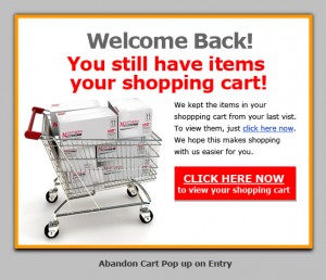
Your abandoned cart program should start the minute people leave your checkout with a pop-up. If you are morally (cough!) opposed to pop-ups, you can use a midi or a catfish, just make sure you use something. The purpose of the pop-up is to collect the user’s e-mail address. If you already have their e-mail address, you don’t necessarily need to use a pop-up although many companies have found that the “STOP! You still have xx items in your cart!” does prevent a significant group of site visitors from leaving. (By the way, pop-ups are completely dependent on creative — so if your copy and art is not compelling, your pop-ups won’t work.)
After you’ve collected the user’s e-mail address, it’s important to dump them immediately into your abandoned cart e-mail program.
The best abandoned cart e-mail programs are a series of 5-6 (often times more) e-mails. As with most triggers, most of the success of your abandoned cart e-mail will come from the things “outside the envelope.” This includes the to address, from address, subject line, preview panel, format and deliverability. Inside, it’s important to make the e-mails look as one-to-one as possible. Personalize the e-mail with their name and the contents of their cart, if you can. (This works well with thumbnails.)
It’s important that you put the phone number in your e-mails several times. The abandoned cart e-mails that work have big action buttons (RETURN TO MY CART NOW!) and lots of phone number plugs.
Whether or not you use an offer is up to you. Offers work — mostly because deadlines create urgency and cause people to focus — but you definitely don’t have to use them to have a good abandoned cart program. If you are going to use offers, you don’t need to use them on the first couple of e-mails. You can but they will work just fine sans discount/bonus. (If they don’t, you need to tweak your messaging.)
Timing is one of the most important variables when it comes to abandoned carts. You should definitely test the timing as every company has it’s own magic formula for what works. However, if you need a place to start, send out the first e-mail immediately (within 2 hours.) Send the second out in 24, the third out in 48, the fourth out in 5 days and the fifth out in 7-8 days. Review the results in 10-14 days and adjust accordingly.
What happens when the user comes back? One of the best techniques is to offer a catfish or a midi reminding the user that there’s something in their cart. You can also test taking the user directly to their cart but often times it won’t work as well as a catfish or a midi likely because your checkout doesn’t look the same as the rest of your site. (Familiarity is very important to users.)
Writing in Pictures….
What does leading-edge look like? How about state of the art? Innovative?
How do you see streamlined? Pioneering? Revolutionary? Integrated approach?
***
Yesterday I blogged about the old brain (aka the brain that buys) being visually oriented. I got several e-mails (yes, e-mails – I get less than 1% of my response in the comments) defending words and how important they are. Not surprisingly, these e-mails weren’t from copywriters but from SEO’s but I digress…
There’s no doubt that words are important. I am not debating that. Words are critical. However, it’s important to note that, by all accounts, language was “invented” approximately 40,000 years ago. Written language came about 10,000 years ago. No matter what your theory of evolution is, you know that the brain has been around for millions. (Over 450 million to be precise.)
The old brain – which is also the brain that makes your buying decisions — sees things in pictures. It’s not qualified to process written language. Yes, it does it but it’s s-l-o-w — and words – especially complicated ones – make it even s-l-o-w-e-r by pushing the decoding process onto the new brain, which makes you want to “think about it” instead of act.
With that said, words ARE important because that’s how people find you in Google, not to mention how they find stuff on your site.
So, what’s the #1 key to online wordsmithing?
Technically, there are two. First, is the word connect. The second is truly one of the biggest secrets to your success and that’s to write in pictures.
At the beginning of this post, I asked you what a bunch of words looked like. I pulled all of them from the home page of a heavily trafficked B2B site. Frankly, it’s almost impossible to picture any of those words. Why? Because they’re not tangible. The buying brain likes tangible words (red hat, for example.)
So, after you write your sales copy, edit it. Eliminate – or at least reduce – the words that would make you “think,” thus slowing down the sales process. Your users — and their actions — will thank you.
How Many Windows Are In Your House?
How many windows are in your house?
I’ll wait while you figure it out.
You’re back?
Ok.
So, how did you count?
Did you go through room by room and count the windows?
You did, right?
That’s because the old brain (aka the brain that buys) is most comfortable when it’s in the visual mode. It’s happiest – and most successful – there.
We SEO our sites till the cows come home so that we can be ranked #1 in Google. We forget that the user who is coming from Google doesn’t see words, it only see pictures.
That’s an issue.
Every page on your website that doesn’t have pictures/graphics/visuals is a dead-end, meaning that the user is NINE TIMES more likely to leave on that page or immediately on one of the two subsequent pages.
This is applicable for every website – whether it’s a blog or a powerhouse ecommerce site.
That means this message is for you.
- « Previous Page
- 1
- …
- 4
- 5
- 6
- 7
- 8
- …
- 11
- Next Page »